<script setup lang="ts">
import { AnimateView, startTransition } from 'motion-v'
import { ref } from 'vue'

const isOpen = ref(false)

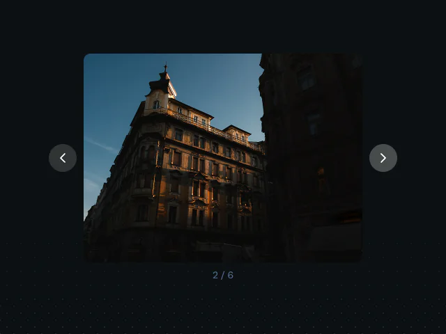
const PHOTO = '/photos/amsterdam-25/image-11.jpg'

const COLLAPSED = 'circle(0% at 50% 50%)'
const REVEALED = 'circle(75% at 50% 50%)'

const enter = {
  clipPath: [COLLAPSED, REVEALED],
  transition: { duration: 0.6, ease: 'easeOut' as const },
}

const exit = {
  clipPath: [REVEALED, COLLAPSED],
  transition: { duration: 0.4, ease: 'easeIn' as const },
}

function toggle() {
  startTransition(() => {
    isOpen.value = !isOpen.value
  })
}
</script>

<template>
  <div class="clip-example">
    <button
      class="clip-button"
      @click="toggle"
    >
      {{ isOpen ? "Close" : "Open" }}
    </button>
    <div class="clip-slot">
      <AnimateView
        v-if="isOpen"
        :enter="enter"
        :exit="exit"
      >
        <img
          class="clip-image"
          :src="PHOTO"
          alt="Amsterdam"
        >
      </AnimateView>
    </div>
  </div>
</template>

<style>
#sandbox {
  justify-content: center;
}
</style>

<style scoped>
.clip-example {
  display: flex;
  flex-direction: column;
  align-items: center;
  gap: 20px;
}

.clip-button {
  padding: 10px 32px;
  background-color: var(--accent);
  color: var(--black);
  border: none;
  border-radius: 10px;
  font-size: 15px;
  font-weight: 600;
  cursor: pointer;
}

.clip-button:hover {
  opacity: 0.9;
}

.clip-slot {
  width: 340px;
  height: 240px;
  border-radius: 16px;
}

.clip-image {
  display: block;
  width: 100%;
  height: 100%;
  object-fit: cover;
  border-radius: 16px;
}
</style>

 AnimateView: App Store
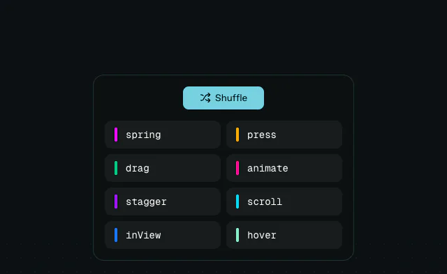 AnimateView: Reorder
 AnimateView: Skeleton