Exit animation
An example of animating an element when it's removed from the DOM using AnimatePresence in Motion for React.

Tutorial
Introduction
The Exit animation example shows how to animate an element before it's removed from the DOM. It uses the AnimatePresence component and exit prop from Motion for React to create smooth transitions when elements are removed.
CSS animations can only handle when elements appear, and even then only with the modern @starting-style rule. They can't handle when elements leave.
Whereas JS animations need careful orchestration to handle when elements leave.
AnimatePresence is a React component that makes it easy to animate elements when they exit.
Get started
Let's start by creating a component with a box that can be toggled on and off:
"use client"

import { useState } from "react"

export default function ExitAnimation() {
    const [isVisible, setIsVisible] = useState(true)

    return (
        <div style={container}>
            {isVisible ? <div style={box} /> : null}
            <button style={button} onClick={() => setIsVisible(!isVisible)}>
                {isVisible ? "Hide" : "Show"}
            </button>
        </div>
    )
}

/**
 * ==============   Styles   ================
 */

const container: React.CSSProperties = {
    display: "flex",
    flexDirection: "column",
    width: 100,
    height: 160,
    position: "relative",
}

const box: React.CSSProperties = {
    width: 100,
    height: 100,
    backgroundColor: "#FF5449",
    borderRadius: "10px",
}

const button: React.CSSProperties = {
    backgroundColor: "#FF5449",
    borderRadius: "10px",
    padding: "10px 20px",
    color: "#000000",
    position: "absolute",
    bottom: 0,
    left: 0,
    right: 0,
}
This creates a simple component with a red box and a button that toggles the box's visibility. Currently, the box just instantly appears and disappears when toggled.
Let's animate!
Import from Motion
To animate our box as it enters and exits, we need to import the necessary components from Motion for React:
import { AnimatePresence, motion } from "motion/react"Let's replace our standard div with a motion.div:
{
    isVisible ? <motion.div style={box} /> : null
}
This alone won't give us exit animations. For that, we need to wrap our conditionally rendered element in AnimatePresence:
<AnimatePresence>
    {isVisible ? <motion.div style={box} /> : null}
</AnimatePresence>
Animations
Now we can add our animation properties. We'll need:
- An
initialstate for when the element first appears. - An
animatestate for its normal visible state. - An
exitstate for how it should animate out before being removed from the DOM byAnimatePresence.
<AnimatePresence initial={false}>
    {isVisible ? (
        <motion.div
            initial={{ opacity: 0, scale: 0 }}
            animate={{ opacity: 1, scale: 1 }}
            exit={{ opacity: 0, scale: 0 }}
            style={box}
            key="box"
        />
    ) : null}
</AnimatePresence>
With these props:
- The box starts invisible and scaled down to nothing
- It animates to fully visible and full size when it appears
- When toggled off, it animates back to invisible and scaled down before being removed from the DOM
A couple important details:
- We set
initial={false}onAnimatePresenceto prevent the initial animation when the component first loads - We added a
keyto our motion component, which is required forAnimatePresenceto track elements properly
Adding button animation
Let's also add a small animation to the button when it's pressed:
<motion.button
    style={button}
    onClick={() => setIsVisible(!isVisible)}
    whileTap={{ y: 1 }}
>
    {isVisible ? "Hide" : "Show"}
</motion.button>
The whileTap prop moves the button down slightly when pressed, creating a satisfying tactile feel.
Conclusion
In this tutorial, we learned how to:
- Create exit animations using the
AnimatePresencecomponent - Define enter and exit animations with the
initial,animate, andexitprops - Create a toggle effect with state and conditional rendering
- Add tactile feedback to interactive elements with
whileTap
Motion for React makes it easy to add these polished transitions to your UI, improving the user experience by maintaining visual continuity when elements are added or removed.
Source code
"use client"

import { AnimatePresence, motion } from "motion/react"
import { useState } from "react"

export default function ExitAnimation() {
    const [isVisible, setIsVisible] = useState(true)

    return (
        <div style={container}>
            <AnimatePresence initial={false}>
                {isVisible ? (
                    <motion.div
                        initial={{ opacity: 0, scale: 0 }}
                        animate={{ opacity: 1, scale: 1 }}
                        exit={{ opacity: 0, scale: 0 }}
                        style={box}
                        key="box"
                    />
                ) : null}
            </AnimatePresence>
            <motion.button
                style={button}
                onClick={() => setIsVisible(!isVisible)}
                whileTap={{ y: 1 }}
            >
                {isVisible ? "Hide" : "Show"}
            </motion.button>
        </div>
    )
}

/**
 * ==============   Styles   ================
 */

const container: React.CSSProperties = {
    display: "flex",
    flexDirection: "column",
    width: 100,
    height: 160,
    position: "relative",
}

const box: React.CSSProperties = {
    width: 100,
    height: 100,
    backgroundColor: "var(--hue-5)",
    borderRadius: "10px",
}

const button: React.CSSProperties = {
    backgroundColor: "var(--hue-5)",
    borderRadius: "10px",
    padding: "10px 20px",
    color: "var(--black)",
    position: "absolute",
    bottom: 0,
    left: 0,
    right: 0,
}Related examples

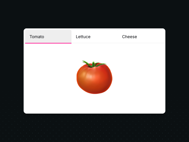

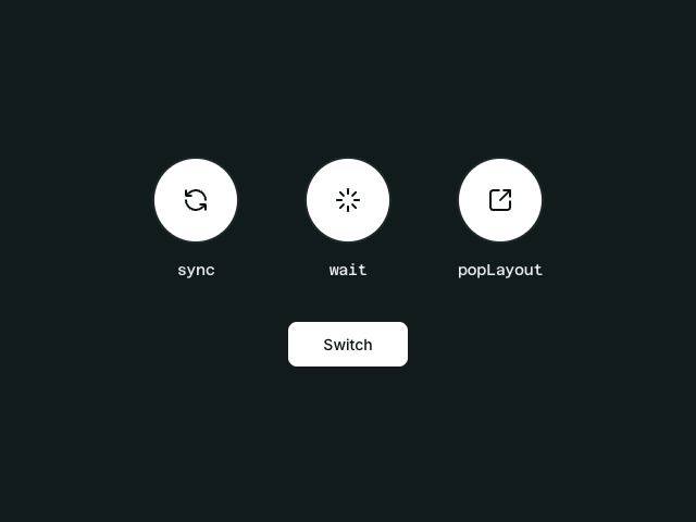
Latest in React

Unlock all 400+ examples
- Source code for every Plus example.
- Provide examples direct to your agent via Motion's MCP.
- Lifetime access to new examples and APIs.