BezierCurveEditor is a React input component that can edit bezier easing curve definitions.
<BezierCurveEditor curve={curve} onChange={setCurve} />BezierCurveEditor is:
-
Keyboard accessible: Tab to control points, move with arrow keys, enable fine-grained control with the shift key.
-
Touch accessible: Large finger-friendly hitboxes invisibly enhance the touchscreen experience.
-
Customisable: Style with simple props adjusting colors, line widths, control point radius and more.
Usage
Import
Once installed, import BezierCurveEditor from "motion-studio".
import { BezierCurveEditor } from "motion-studio"Render
BezierCurveEditor works like a standard React controlled input. Provide it a curve state and a onChange function that'll fire with the latest state.
const [curve, setCurve] = useState([0.3, 0, 0.6, 1])

return <BezierCurveEditor curve={curve} onChange={setCurve} />
Edit
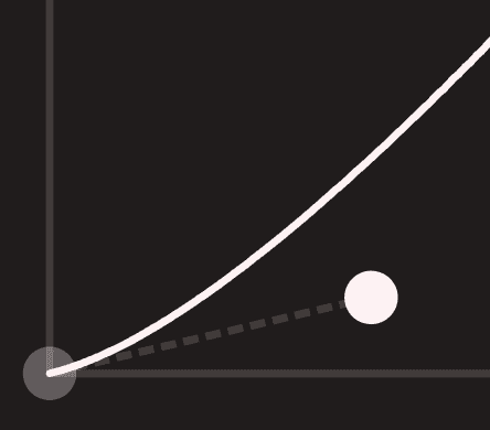
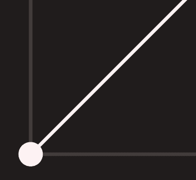
Dragging control points will update the curve via the provided onChange function.
Control points can be reset by pressing the home point at the end of their tether. It's also possible to press and drag out from these points in one gesture.
Keyboard accessibility
BezierCurveEditor is keyboard-accessible by default. Users can use the tab key to focus a control point, indicated by a focus ring:
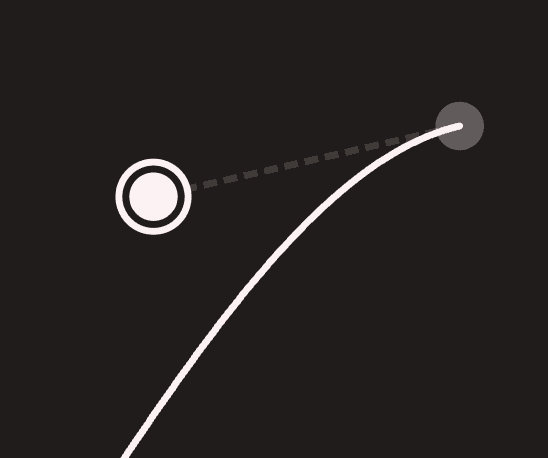
While focused, arrow keys will move the control point around, editing the curve point in 0.1 increments. Holding the shift key will enable fine-grained control of 0.01 increments.
Touch accessibility
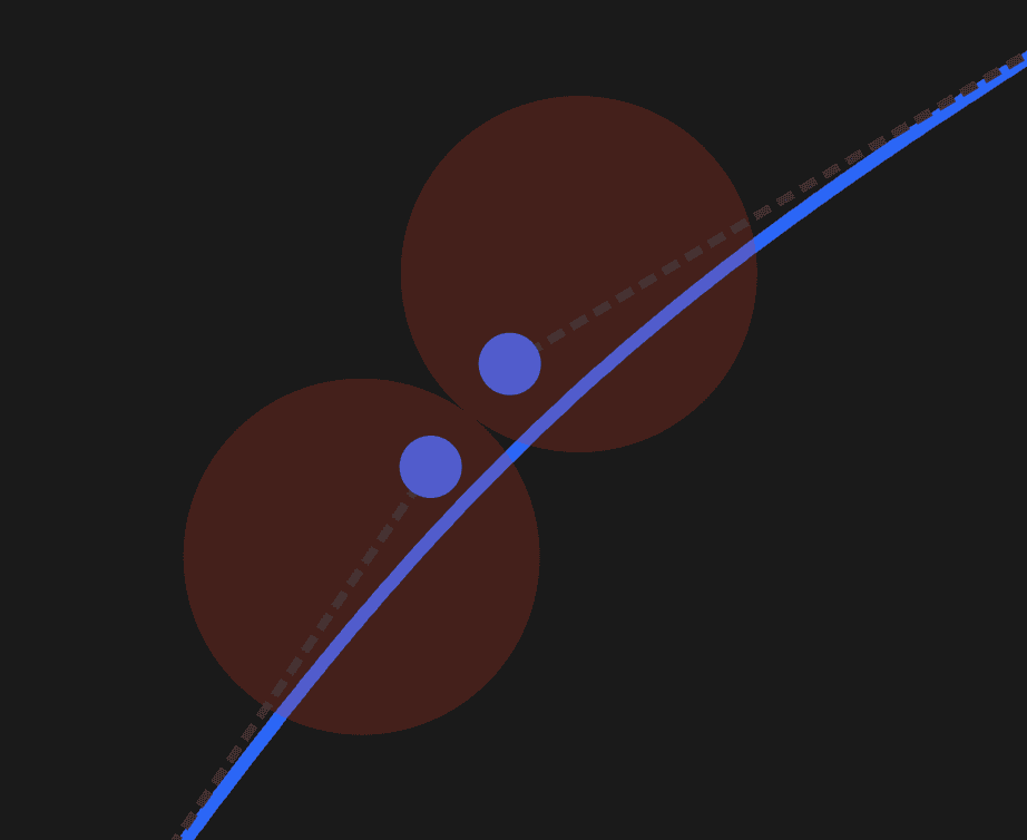
Control points are visually small, but remain touch-friendly thanks to oversized transparent hit points.
These can be visualised by setting the debug prop to true:
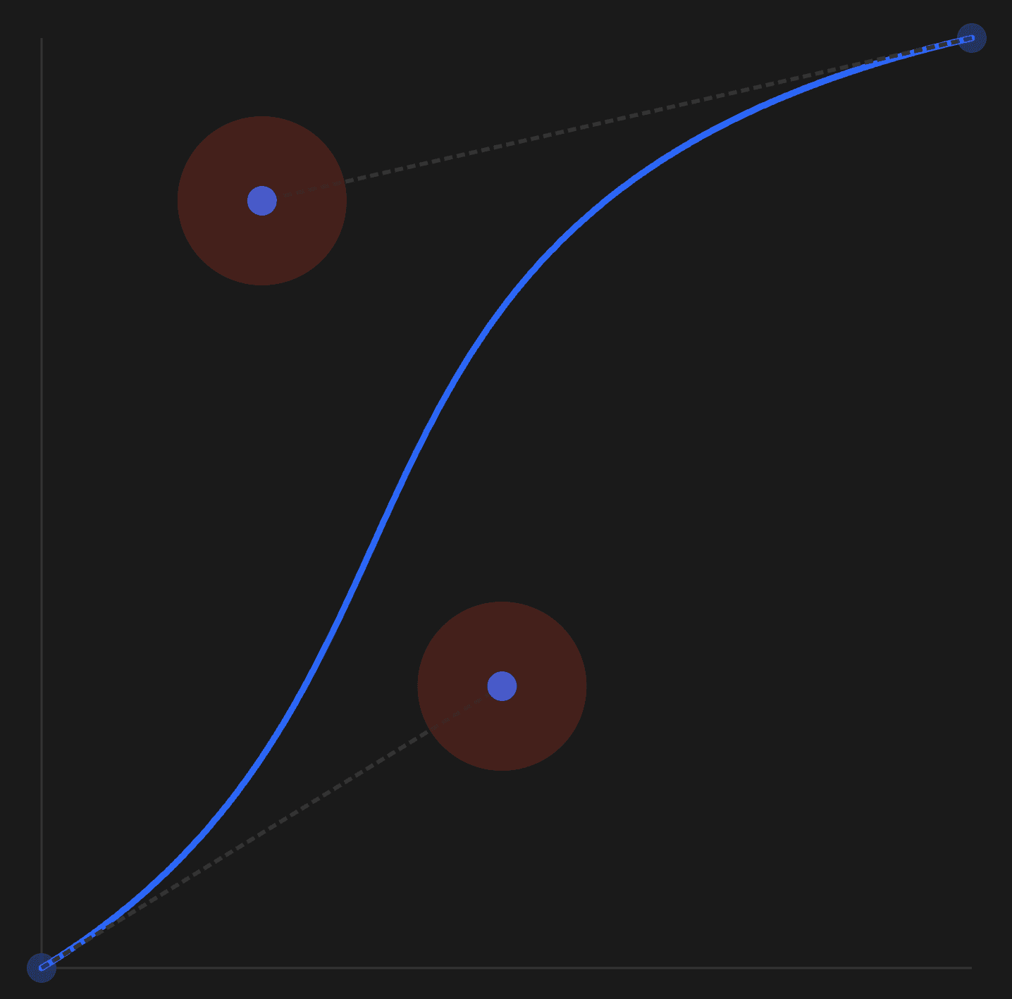
Hit points will automatically shift to ensure they don't overlap when control points are close.
Props
curve
Required. An array of valid bezier curve points:
const [curve, setCurve] = useState([0.3, 0, 0.6, 1])

return <BezierCurveEditor curve={curve} onChange={setCurve} />
onChange
Required. A function to trigger when the bezier curve is updated.
const [curve, setCurve] = useState([0.3, 0, 0.6, 1])

return <BezierCurveEditor curve={curve} onChange={setCurve} />
Styling
BezierCurveEditor provides the following styling props:
color
Default: #fff
Set the color of the curve visualisation, control point and control point focus rings.
pathWith
Default: 3
Set the path width of the curve visualsation.
axisColor
Default: #fff
Set the color of the x/y axis lines.
axisWidth
Default: 3
Set the width of the x/y axis lines.
controlRadius
Default: 7
Set the radius of the control handles.
hitRadius
Default: 40
Set the radius of the control handle hit points. These are translucent areas that serve as the hitboxes for the control handles to enhance their usability on touch screens.
tetherWidth
Default: 2
Set the width of the path tethering the control handles to the curve.
tetherDashArray
Default: "4, 2"
Set the dasharray of the path tethering the control handles to the curve.