<script setup lang="tsx">
/** @jsxImportSource vue */
import { AnimateNumber } from "motion-plus-vue"
import { motion } from "motion-v"
import { ref } from "vue"

const isCompact = ref(false)
const isCurrency = ref(false)

function Switch({ isOn, toggle }: { isOn: boolean; toggle: () => void }) {
    return (
        <motion.button
            class="switch-container"
            style={{
                justifyContent: `flex-${isOn ? "end" : "start"}`,
            }}
            initial={false}
            animate={{
                backgroundColor: isOn
                    ? "var(--hue-6-transparent)"
                    : "#586d8c33",
            }}
            onClick={toggle}
            focus={{
                outline: "2px solid #4ff0b7",
            }}
        >
            <motion.div
                class="switch-handle"
                layout
                data-is-on={isOn}
                transition={{
                    type: "spring",
                    visualDuration: 0.2,
                    bounce: 0.2,
                }}
            />
        </motion.button>
    )
}
</script>

<template>
    <div class="container">
        <AnimateNumber
            :format="{
                notation: isCompact ? 'compact' : undefined,
                compactDisplay: isCompact ? 'short' : undefined,
                roundingMode: isCompact ? 'trunc' : undefined,
                style: isCurrency ? 'currency' : undefined,
                currency: isCurrency ? 'USD' : undefined,
            }"
            locales="en-US"
            class="number"
            :transition="{
                visualDuration: 0.6,
                type: 'spring',
                bounce: 0.25,
                opacity: { duration: 0.3, ease: 'linear' },
            }"
            :value="123.49"
        >

        </AnimateNumber>
        <div class="controls">
            <div>
                Currency:
                <Switch
                    :isOn="isCurrency"
                    :toggle="() => isCurrency = !isCurrency"
                />
            </div>
            <div>
                Compact:
                <Switch
                    :isOn="isCompact"
                    :toggle="() => isCompact = !isCompact"
                />
            </div>
        </div>
    </div>
</template>

<style>
.container {
    display: flex;
    flex-direction: column;
    align-items: center;
    gap: 20px;
}

.number {
    font-size: 78px;
}

.controls {
    display: flex;
    gap: 20px;
    border-radius: 50px;
}

.controls > div {
    display: flex;
    align-items: center;
    gap: 10px;
    font-size: 18px;
}

.switch-container {
    width: 40px;
    height: 20px;
    border-radius: 25px;
    cursor: pointer;
    display: flex;
    padding: 5px;
}

.switch-handle {
    width: 20px;
    height: 20px;
    background-color: #4ff0b7;
    border-radius: 50%;
}
</style>

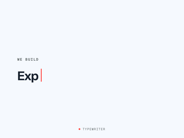 Typewriter: Change Content
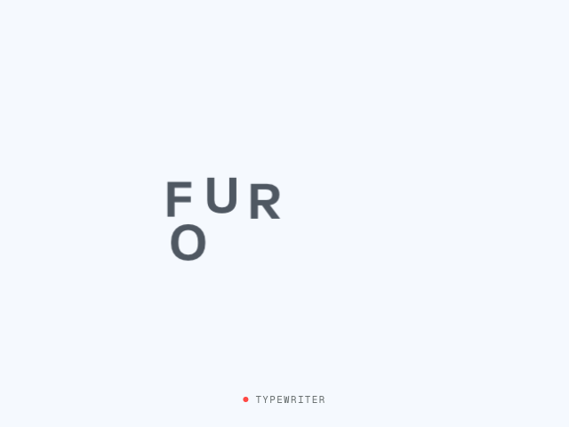 Typewriter: Exploding Countdown
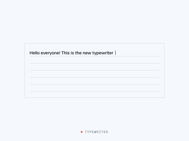 Typewriter: Natural Typing