"use client"

import { motion } from "motion/react"
import { useEffect, useRef, useState } from "react"

const ui = { type: "spring", stiffness: 305, damping: 33 } as const
const lively = { type: "spring", stiffness: 622, damping: 17 } as const

const hold = 1
const circumference = 2 * Math.PI * 72

type State = "locked" | "holding" | "unlocked"

const ringState: Record<State, string> = {
  locked: "rest",
  holding: "pressed",
  unlocked: "unlocked",
}

const labels: Record<State, string> = {
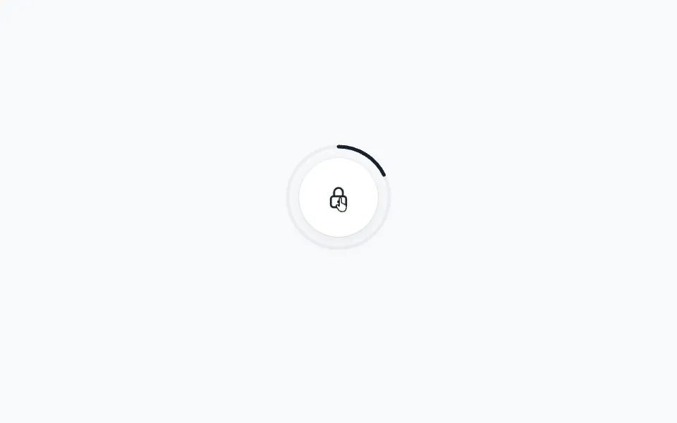
  locked: "Hold to unlock",
  holding: "Keep holding",
  unlocked: "Unlocked",
}

export default function LongPress() {
  const [state, setState] = useState<State>("locked")

  // After an unlock the ring resets at once, not with a spring
  const wasUnlocked = useRef(false)
  useEffect(() => {
    wasUnlocked.current = state === "unlocked"
  }, [state])

  const unlock = () => {
    navigator.vibrate?.(12)
    setState("unlocked")
  }

  // Lock again a moment after unlocking
  useEffect(() => {
    if (state !== "unlocked") return
    const timeout = setTimeout(() => setState("locked"), 1800)
    return () => clearTimeout(timeout)
  }, [state])

  const isUnlocked = state === "unlocked"

  return (
    <div className="lp-lock">
      <div className="lp-dial">
        <motion.svg
          className="lp-ring"
          width="160"
          height="160"
          viewBox="0 0 160 160"
          aria-hidden="true"
          initial={false}
          animate={isUnlocked ? "unlocked" : "rest"}
          variants={{
            rest: { scale: 1, opacity: 1, transition: { duration: 0 } },
            // The ring pulses out as the lock opens
            unlocked: {
              scale: [1, 1.1],
              opacity: [1, 0],
              transition: { duration: 0.5, ease: [0.2, 0, 0, 1] },
            },
          }}
        >
          <circle className="lp-track" cx="80" cy="80" r="72" />
          <motion.circle
            className="lp-progress"
            cx="80"
            cy="80"
            r="72"
            strokeDasharray={circumference}
            // An attribute, not a class rule, so the unlock can turn it green
            stroke="#18222e"
            initial={false}
            animate={ringState[state]}
            custom={wasUnlocked.current}
            variants={{
              rest: (fromUnlocked: boolean) => ({
                strokeDashoffset: circumference,
                opacity: 0,
                stroke: "#18222e",
                transition: fromUnlocked ? { duration: 0 } : ui,
              }),
              pressed: {
                strokeDashoffset: 0,
                opacity: 1,
                transition: {
                  strokeDashoffset: { duration: hold, ease: "linear" },
                  opacity: { duration: 0.1 },
                },
              },
              unlocked: {
                strokeDashoffset: 0,
                opacity: 1,
                stroke: "#2fbf71",
                transition: { duration: 0.2 },
              },
            }}
            // The ring is full after `hold` seconds: unlock while still held
            onAnimationComplete={(definition) =>
              definition === "pressed" && unlock()
            }
          />
        </motion.svg>
        {/*
         * tap={{ hold }} makes a press shorter than `hold` seconds a
         * cancel, so onTapCancel fires and the ring springs back.
         * onTapStart starts filling the ring over the same time.
         */}
        <motion.button
          className="lp-button"
          aria-label="Hold to unlock"
          tap={{ hold }}
          onTapStart={() => !isUnlocked && setState("holding")}
          onTapCancel={() => !isUnlocked && setState("locked")}
          initial={false}
          animate={isUnlocked ? "unlocked" : "rest"}
          whileTap={isUnlocked ? undefined : "pressed"}
          variants={{
            rest: { scale: 1, backgroundColor: "#ffffff", color: "#18222e" },
            pressed: { scale: 0.92 },
            unlocked: {
              scale: 1,
              backgroundColor: "#2fbf71",
              color: "#ffffff",
            },
          }}
          // Colours fade like the JS version's CSS transition, without
          // the spring's overshoot
          transition={{
            ...lively,
            backgroundColor: { duration: 0.3 },
            color: { duration: 0.3 },
          }}
        >
          <svg
            className="lp-icon"
            width="40"
            height="40"
            viewBox="0 0 24 24"
            aria-hidden="true"
          >
            <motion.path
              className="lp-shackle"
              d="M8 11V7.5a4 4 0 0 1 8 0V11"
              variants={{
                rest: { y: 0 },
                pressed: { y: -1 },
                unlocked: { y: -4 },
              }}
              transition={lively}
            />
            <rect
              className="lp-body"
              x="5"
              y="11"
              width="14"
              height="10"
              rx="2.5"
            />
            <circle className="lp-keyhole" cx="12" cy="16" r="1.25" />
          </svg>
        </motion.button>
      </div>
      <motion.p
        key={state}
        className="lp-label"
        aria-live="polite"
        initial={{ opacity: 0, filter: "blur(4px)", y: 4 }}
        animate={{ opacity: 1, filter: "blur(0px)", y: 0 }}
        transition={ui}
      >
        {labels[state]}
      </motion.p>
      <Stylesheet />
    </div>
  )
}

function Stylesheet() {
  return (
    <style>{`
      .lp-lock {
        display: flex;
        flex-direction: column;
        align-items: center;
        gap: 20px;
        font-family: -apple-system, BlinkMacSystemFont, "Segoe UI", sans-serif;
        user-select: none;
        -webkit-user-select: none;
      }

      .lp-dial {
        position: relative;
        width: 160px;
        height: 160px;
        display: flex;
        align-items: center;
        justify-content: center;
      }

      .lp-ring {
        position: absolute;
        inset: 0;
        pointer-events: none;
      }

      .lp-ring circle {
        transform: rotate(-90deg);
        transform-origin: center;
        fill: none;
        stroke-width: 5;
        stroke-linecap: round;
      }

      .lp-track {
        stroke: #eceef2;
      }

      .lp-button {
        width: 120px;
        height: 120px;
        border-radius: 50%;
        border: none;
        padding: 0;
        display: flex;
        align-items: center;
        justify-content: center;
        box-sizing: border-box;
        background: #ffffff;
        color: #18222e;
        box-shadow:
          0 0 0 1px rgba(24, 34, 46, 0.06),
          0 1px 2px rgba(24, 34, 46, 0.06),
          0 8px 24px rgba(24, 34, 46, 0.08);
        cursor: pointer;
        touch-action: none;
        -webkit-touch-callout: none;
      }

      .lp-button:focus-visible {
        outline: 2px solid #2563eb;
        outline-offset: 6px;
      }

      .lp-icon {
        overflow: visible;
      }

      .lp-shackle,
      .lp-body {
        fill: none;
        stroke: currentColor;
        stroke-width: 1.75;
        stroke-linecap: round;
        stroke-linejoin: round;
      }

      .lp-keyhole {
        fill: currentColor;
      }

      .lp-label {
        margin: 0;
        font-size: 15px;
        font-weight: 500;
        letter-spacing: -0.01em;
        color: #60687a;
      }
    `}</style>
  )
}

 Long press