"use client"

import { AnimatePresence, motion, useAnimate } from "motion/react"
import { useRef, useState } from "react"

const snap = { type: "spring", stiffness: 1218, damping: 70 } as const
const ui = { type: "spring", stiffness: 305, damping: 33 } as const
const lively = { type: "spring", stiffness: 622, damping: 17 } as const

const min = 0
const max = 99

export default function Stepper() {
  const [value, setValue] = useState(2)
  const [direction, setDirection] = useState(1)
  const [valueRef, animateValue] = useAnimate()
  const latest = useRef(value)

  const step = (change: number) => {
    const next = Math.min(max, Math.max(min, latest.current + change))

    if (next === latest.current) {
      // At a limit: a small shake says no
      animateValue(
        valueRef.current,
        { x: [0, 5 * change, -3 * change, 0] },
        { duration: 0.3 },
      )
      return
    }

    latest.current = next
    setDirection(change)
    setValue(next)
  }

  return (
    <div className="st-stepper">
      <span className="st-title" id="guests-label">
        Guests
      </span>
      <div className="st-control">
        <StepButton change={-1} onStep={step} disabled={value === min} />
        <div
          ref={valueRef}
          className="st-value"
          role="status"
          aria-labelledby="guests-label"
        >
          <AnimatePresence initial={false} custom={direction}>
            <motion.span
              key={value}
              className="st-digit"
              custom={direction}
              variants={{
                enter: (d: number) => ({
                  y: 18 * d,
                  opacity: 0,
                  filter: "blur(4px)",
                }),
                center: { y: 0, opacity: 1, filter: "blur(0px)" },
                exit: (d: number) => ({
                  y: -18 * d,
                  opacity: 0,
                  filter: "blur(4px)",
                  transition: { ...snap, opacity: { duration: 0.12 } },
                }),
              }}
              initial="enter"
              animate="center"
              exit="exit"
              transition={ui}
            >
              {value}
            </motion.span>
          </AnimatePresence>
        </div>
        <StepButton change={1} onStep={step} disabled={value === max} />
      </div>
      <span className="st-hint">Hold to keep counting</span>
      <Stylesheet />
    </div>
  )
}

function StepButton({
  change,
  onStep,
  disabled,
}: {
  change: number
  onStep: (change: number) => void
  disabled: boolean
}) {
  const [scope, animate] = useAnimate()

  return (
    <motion.button
      ref={scope}
      className="st-step"
      aria-label={change > 0 ? "Add guest" : "Remove guest"}
      aria-disabled={disabled || undefined}
      /**
       * After a 0.4 second hold, onTap fires every 0.08 seconds. The first
       * step happens on press down, like a native stepper.
       */
      tap={{ hold: 0.4, repeat: 0.08 }}
      onTapStart={() => onStep(change)}
      onTap={(event) => {
        // onTap also fires when the press is released. Only step on repeats.
        if (event.type === "pointerup") return
        onStep(change)
        animate(scope.current, { scale: [0.82, 0.88] }, lively)
      }}
      whileTap={{ scale: 0.88, transition: snap }}
      transition={lively}
    >
      <svg width="18" height="18" viewBox="0 0 18 18" aria-hidden="true">
        <path d={change > 0 ? "M4 9h10M9 4v10" : "M4 9h10"} />
      </svg>
    </motion.button>
  )
}

function Stylesheet() {
  return (
    <style>{`
      .st-stepper {
        display: flex;
        flex-direction: column;
        align-items: center;
        gap: 14px;
        font-family: -apple-system, BlinkMacSystemFont, "Segoe UI", sans-serif;
        user-select: none;
        -webkit-user-select: none;
      }

      .st-title {
        font-size: 13px;
        font-weight: 500;
        color: #60687a;
      }

      .st-hint {
        font-size: 13px;
        color: #9aa1ae;
      }

      .st-control {
        display: flex;
        align-items: center;
        gap: 4px;
        padding: 6px;
        border-radius: 999px;
        background: #ffffff;
        box-shadow:
          0 0 0 1px rgba(24, 34, 46, 0.06),
          0 1px 2px rgba(24, 34, 46, 0.06),
          0 8px 24px rgba(24, 34, 46, 0.08);
      }

      .st-step {
        width: 48px;
        height: 48px;
        border: none;
        border-radius: 50%;
        padding: 0;
        display: flex;
        align-items: center;
        justify-content: center;
        background: #f1f3f6;
        color: #18222e;
        cursor: pointer;
        touch-action: none;
        -webkit-touch-callout: none;
        transition:
          background-color 0.2s,
          color 0.2s;
      }

      .st-step:hover {
        background: #e8ebf0;
      }

      .st-step[aria-disabled] {
        color: #b8bec9;
      }

      .st-step:focus-visible {
        outline: 2px solid #2563eb;
        outline-offset: 2px;
      }

      .st-step path {
        fill: none;
        stroke: currentColor;
        stroke-width: 1.75;
        stroke-linecap: round;
      }

      .st-value {
        position: relative;
        width: 72px;
        height: 48px;
        overflow: hidden;
      }

      .st-digit {
        position: absolute;
        inset: 0;
        display: flex;
        align-items: center;
        justify-content: center;
        font-size: 28px;
        font-weight: 600;
        letter-spacing: -0.02em;
        font-variant-numeric: tabular-nums;
        color: #18222e;
      }
    `}</style>
  )
}

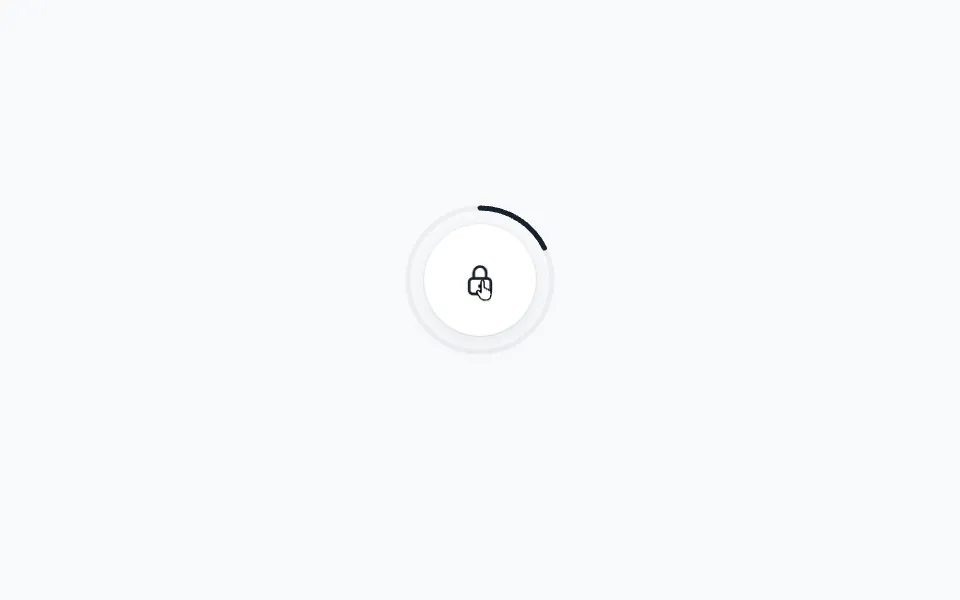 Long press
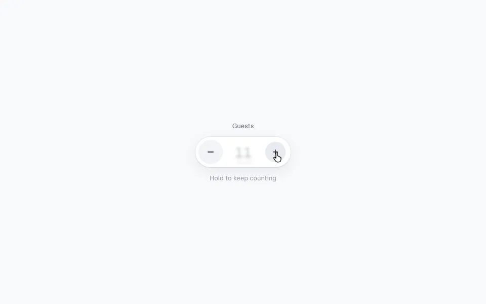 Press and hold to repeat
 Long press