<script setup lang="tsx">
/** @jsxImportSource vue */
import { ref, defineComponent } from 'vue'
import { motion, MotionConfig } from 'motion-v'

function generateId() {
  return Math.random().toString(36).substring(2, 9)
}

const Item = defineComponent({
  props: {
    header: {
      type: String,
      required: true
    }
  },
  setup(props, { slots }) {
    const isOpen = ref(false)
    const hasFocus = ref(false)
    const id = generateId()

    const onlyKeyboardFocus = (callback: () => void) => {
      return (e: FocusEvent) => {
        const target = e.target as HTMLElement
        if (e.type === "focus" && target.matches(":focus-visible")) {
          callback()
        }
      }
    }

    return () => (
      <MotionConfig transition={{ duration: 0.3 }}>
        <motion.section
          initial={false}
          animate={isOpen.value ? "open" : "closed"}
        >
          <h3>
            <motion.button
              id={id + "-button"}
              aria-expanded={isOpen.value}
              aria-controls={id}
              onClick={() => isOpen.value = !isOpen.value}
              onFocus={onlyKeyboardFocus(() => hasFocus.value = true)}
              onBlur={() => hasFocus.value = false}
              whilePress="pressed"
            >
              <span>{props.header}</span> <ChevronDownIcon />
              {hasFocus.value && (
                <motion.div
                  layoutId="focus-ring"
                  class="focus-ring"
                  variants={{
                    pressed: { scale: 0.98 },
                  }}
                  transition={{
                    type: "spring",
                    visualDuration: 0.2,
                    bounce: 0.2,
                  }}
                />
              )}
            </motion.button>
          </h3>
          <motion.div
            variants={{
              open: {
                height: "auto",
                maskImage:
                  "linear-gradient(to bottom, black 100%, transparent 100%)",
              },
              closed: {
                height: 0,
                maskImage:
                  "linear-gradient(to bottom, black 50%, transparent 100%)",
              },
            }}
            id={id}
            aria-labelledby={id + "-button"}
            class="accordion-content"
          >
            <motion.div
              variants={{
                open: {
                  filter: "blur(0px)",
                  opacity: 1,
                },
                closed: {
                  filter: "blur(2px)",
                  opacity: 0,
                },
              }}
            >
              {slots.default?.()}
            </motion.div>
          </motion.div>
          <hr />
        </motion.section>
      </MotionConfig>
    )
  }
})

function ChevronDownIcon() {
  return (
    <motion.svg
      xmlns="http://www.w3.org/2000/svg"
      width="24"
      height="24"
      viewBox="0 0 24 24"
      fill="none"
      stroke="currentColor"
      stroke-width="2"
      stroke-linecap="round"
      stroke-linejoin="round"
      variants={{
        open: { rotate: 180 },
        closed: { rotate: 0 },
      }}
    >
      <path d="m6 9 6 6 6-6" />
    </motion.svg>
  )
}
</script>

<template>
  <div class="accordion">
    <Item header="What is Motion+?">
      <p>
        Motion+ is a one-time fee, lifetime access membership
        that unlocks the source code for all Motion examples,
        early access features, premium components, and an
        exclusive Discord community.
      </p>
    </Item>
    <Item header="What does 'lifetime access' mean?">
      <p>
        Just that! No one needs another subscription in their
        life.
      </p>
      <p>
        Lifetime access means you'll receive all updates to Motion+ as they're released.
      </p>
    </Item>
    <Item header="How does the team package work?">
      <p>
        After purchase, you can nominate up to 10 team members
        to join Motion+.
      </p>
    </Item>
  </div>
</template>

<style>
.accordion {
  display: flex;
  flex-direction: column;
  margin: 20px;
  background: var(--layer);
  border: 1px solid var(--border);
  border-radius: 10px;
  min-width: 300px;
  max-width: 500px;
}

.accordion section {
  padding: 20px;
  position: relative;
}

.accordion h3 {
  margin: 0;
  display: flex;
}

.accordion hr {
  margin: 0;
  border: 0;
  border-bottom: 1px solid var(--border);
  position: absolute;
  bottom: 0;
  left: 20px;
  right: 20px;
  z-index: 0;
}

.accordion section:last-child hr {
  display: none;
}

.accordion h3 button {
  display: flex;
  justify-content: space-between;
  align-items: center;
  flex: 1;
  position: relative;
}

.accordion h3 span,
.accordion h3 svg {
  text-align: left;
  z-index: 1;
  position: relative;
}

.accordion .focus-ring {
  position: absolute;
  inset: -10px;
  background: var(--hue-4-transparent);
  border-radius: 5px;
  z-index: 0;
}

.accordion-content {
  overflow: hidden;
}

.accordion-content > div {
  padding: 20px 0 0;
}

.accordion-content p {
  line-height: 1.5;
  padding: 0;
  margin: 0;
}
</style>

 Modal dialog
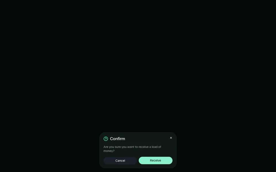 Family-style dialog
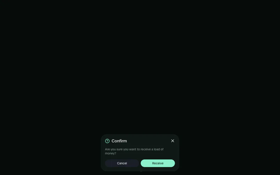 Family-style dialog