<script setup>
import { AnimatePresence, motion } from 'motion-v'
import { Dialog } from 'reka-ui/namespaced'


const dialogOpenState = {
  opacity: 1,
  filter: 'blur(0px)',
  rotateX: 0,
  rotateY: 0,
  z: 0,
  transition: {
    delay: 0.2,
    duration: 0.5,
    ease: [0.17, 0.67, 0.51, 1],
    opacity: {
      delay: 0.2,
      duration: 0.5,
      ease: 'easeOut',
    },
  },
}

const dialogInitialState = {
  opacity: 0,
  filter: 'blur(10px)',
  z: -100,
  rotateY: 25,
  rotateX: 5,
  transformPerspective: 500,
  transition: {
    duration: 0.3,
    ease: [0.67, 0.17, 0.62, 0.64],
  },
}
</script>

<template>
  <div class="container">
    <Dialog.Root>
      <Dialog.Trigger as-child>
        <motion.button
          class="openButton"
          :whileHover="{ scale: 1.1 }"
          :whilePress="{ scale: 1.05 }"
          data-primary-action
        >
          Open Dialog
        </motion.button>
      </Dialog.Trigger>

      <Dialog.Portal>
        <AnimatePresence multiple>
          <Dialog.Overlay as-child>
            <motion.div class="overlay" :initial="{ opacity: 0 }" :animate="{ opacity: 1 }" :exit="{ opacity: 0 }" />
          </Dialog.Overlay>
          <Dialog.Content as-child>
            <motion.div class="modal-container" :initial="dialogInitialState" :animate="dialogOpenState"
              :exit="dialogInitialState" :style="{ transformPerspective: 500 }">
              <div class="example-modal">
                <Dialog.Title class="title">
                  Confirm
                </Dialog.Title>
                <Dialog.Description>
                  Are you sure you want to become a Motion expert?
                </Dialog.Description>
                <div class="controls">
                  <Dialog.Close as-child>
                    <button class="cancel">
                      Cancel
                    </button>
                  </Dialog.Close>
                  <Dialog.Close as-child>
                    <button>
                      Expert me
                    </button>
                  </Dialog.Close>
                </div>
              </div>
            </motion.div>
          </Dialog.Content>
        </AnimatePresence>
      </Dialog.Portal>
    </Dialog.Root>
  </div>
</template>

<style>
.container {
  display: flex;
  align-items: center;
  justify-content: center;
  min-height: 200px;
}

.openButton,
.controls button {
  background-color: var(--hue-1);
  color: var(--white);
  font-size: 16px;
  padding: 10px 20px;
  border-radius: 10px;
}

.controls {
  border-top: 1px solid var(--divider);
  padding-top: 20px;
  margin-top: 20px;
  display: flex;
  justify-content: flex-end;
  gap: 10px;
}

.controls button.cancel {
  background-color: var(--divider);
}

.example-modal {
  border-radius: 10px;
  border: 1px solid var(--border);
  background-color: var(--layer);
  z-index: 10000000;
  padding: 20px;
  min-width: 300px;
  pointer-events: auto;
}

.title {
  font-size: 24px;
  margin: 0 0 20px;
}

.overlay {
  background: rgba(0, 0, 0, 0.5);
  position: fixed;
  inset: 0;
  z-index: 9999998;
  backdrop-filter: blur(3px);
}

.modal-container {
  position: fixed;
  inset: 0;
  z-index: 9999999;
  display: flex;
  align-items: center;
  justify-content: center;
  pointer-events: none;
}
</style>

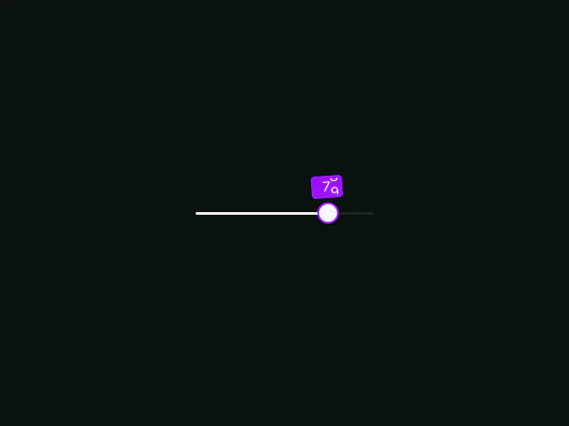 Radix: Slider with AnimateNumber
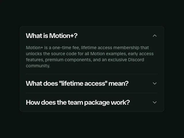 Radix: Accordion
 Radix: Checkbox