iOS App Folder
An iOS-style app folder that expands to reveal apps inside, using Motion for React's layout animations and AnimatePresence.

Tutorial
Introduction
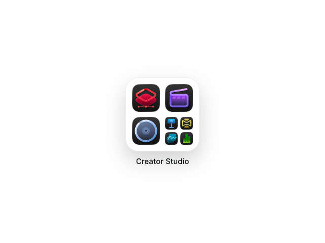
The iOS App Folder example recreates the familiar iOS folder interaction where tapping a folder expands it to reveal all the apps inside. This example showcases several advanced layout animation techniques from Motion for React, creating a polished, native-feeling experience.
We'll use AnimatePresence with mode="popLayout" to smoothly transition between the closed and open folder states, the layoutId prop to create seamless shared element transitions between the mini-grid and expanded view, MotionConfig to set a consistent transition for all layout animations, and traditional animation props like initial, animate, and exit for items that don't have layoutId.
The example also demonstrates staggered animations where different items animate at different times based on their position, and position measurement techniques using useLayoutEffect to calculate where items should animate from.
The clever technique here is combining two animation approaches. Some items (those with layoutId) appear in both the mini-grid and expanded view, smoothly morphing between positions. Other items animate in from the center of the mini-grid using scale and position transforms, creating the illusion they're emerging from the folder.
Get started
Let's start with the basic structure. We'll create a closed folder with a mini-grid preview and an overlay that appears when opened.
"use client"

import { AnimatePresence, motion, MotionConfig } from "motion/react"
import { useState } from "react"

function AppTile({ iconSrc, label, layoutId }) {
    return (
        <motion.img
            className="tile"
            src={iconSrc}
            alt={label}
            aria-label={label}
            layoutId={layoutId}
            draggable={false}
        />
    )
}

export default function IosAppFolder({ title = "Creator Studio", items = [] }) {
    const layoutSpring = {
        type: "spring",
        stiffness: 200,
        damping: 22,
        bounce: 0,
    }

    const [isOpen, setIsOpen] = useState(false)

    return (
        <MotionConfig transition={layoutSpring}>
            <div id="example">
                <AnimatePresence mode="popLayout" initial={false}>
                    {!isOpen ? (
                        <motion.div
                            key="closed"
                            className="closed-root"
                            onClick={() => setIsOpen(true)}
                        >
                            <div className="folder-preview">
                                <div className="folder-grid">
                                    {/* Apps will go here */}
                                </div>
                            </div>
                            <div className="folder-name">{title}</div>
                        </motion.div>
                    ) : (
                        <motion.div
                            key="open"
                            className="open-overlay"
                            onClick={() => setIsOpen(false)}
                        >
                            <div className="open-folder">
                                <div className="open-title">{title}</div>
                                <div className="open-grid">
                                    {/* Expanded apps will go here */}
                                </div>
                            </div>
                        </motion.div>
                    )}
                </AnimatePresence>
            </div>
            <Stylesheet />
        </MotionConfig>
    )
}

function Stylesheet() {
    return (
        <style>
            {/** Copy styles from example source code */}
        </style>
    )
}
We've wrapped everything in MotionConfig with our layoutSpring transition. This sets a default transition for all descendant motion components, so we don't need to pass transition props everywhere. Individual components can still override this default with their own transition prop when needed.
We've also set up AnimatePresence with mode="popLayout". AnimatePresence ensures layout animations complete before the next component mounts, preventing visual glitches when elements share layoutId values. popLayout literally "pops" exiting elements out of the layout so surrounding items can reflow immediately.
The key prop on each state is important. AnimatePresence uses it to track which component is entering or exiting.
Related examples
Latest in React

Unlock all 400+ examples
- Source code for every Plus example.
- Provide examples direct to your agent via Motion's MCP.
- Lifetime access to new examples and APIs.