Live · Cursor
Cursor
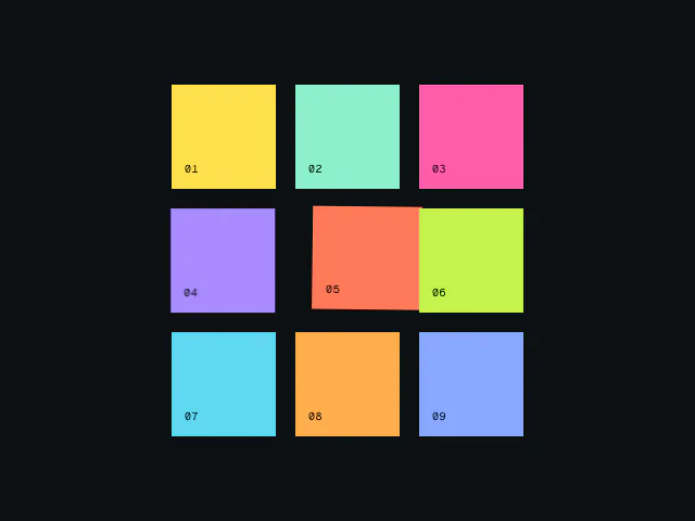
A custom cursor that snaps to targets, morphs its size and adapts to the content below it.
npx shadcn@latest add @motion/cursorExamples built with Cursor
Components that make people stop scrolling. Cursor, Carousel, Ticker and more, built by the team behind Motion and ready to install.
Included in Motion+Engineering-heavy pieces that are hard to get right and easy to feel. Each one is headless and ships with real examples.
A custom cursor that snaps to targets, morphs its size and adapts to the content below it.
npx shadcn@latest add @motion/cursorExamples built with Cursor
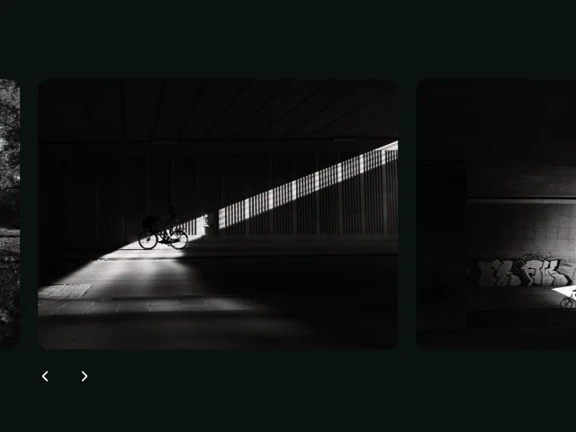
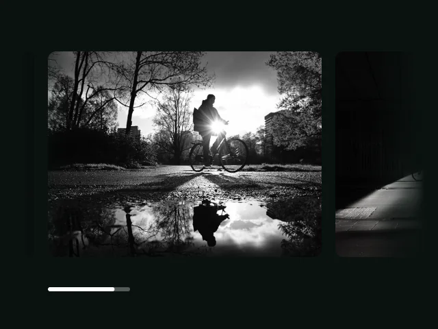
Snap, drag, wheel and loop. A headless production carousel with a simple API.
npx shadcn@latest add @motion/carouselExamples built with Carousel
Infinite marquees with true speed control and a minimal-clone algorithm.
npx shadcn@latest add @motion/tickerExamples built with Ticker
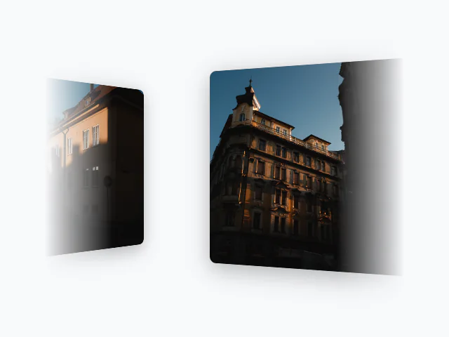
Wipe, blind, iris and pixel transitions over page and element swaps. Includes useCurtains for React.
npx shadcn@latest add @motion/curtainsExamples built with Curtains
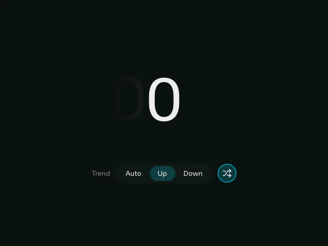
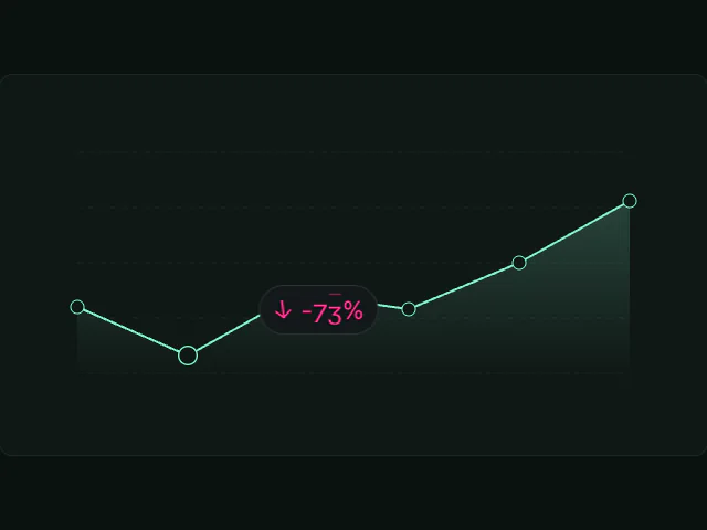
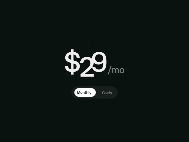
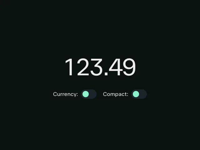
Fluid number transitions for counters, prices and live stats.
npx shadcn@latest add @motion/animate-numberExamples built with AnimateNumber
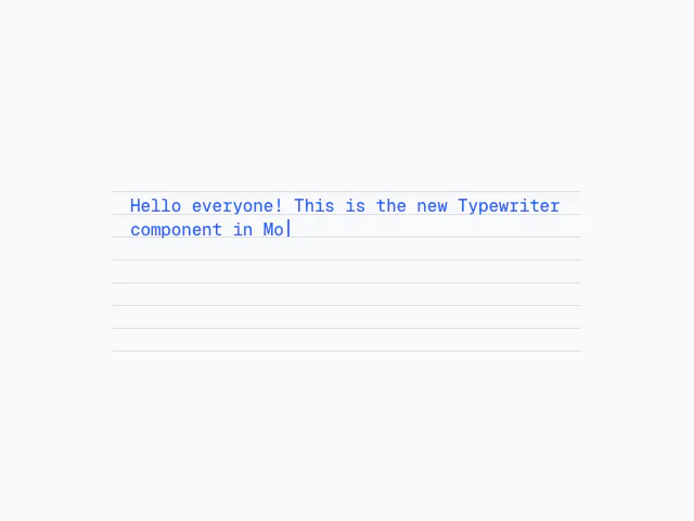
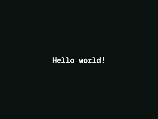
Typing with a natural rhythm: pauses that follow the content and a variable speed.
npx shadcn@latest add @motion/typewriterExamples built with Typewriter
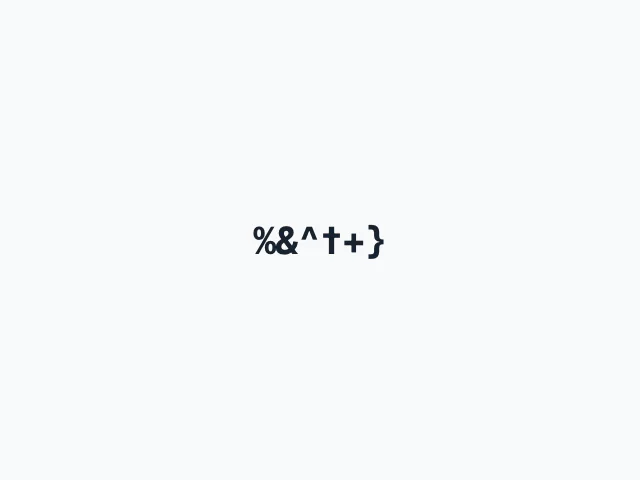
Decode-style text that scrambles between strings on cue.
npx shadcn@latest add @motion/scramble-textExamples built with ScrambleText
Split text into characters, words and lines, ready to animate.
npx shadcn@latest add @motion/split-textExamples built with splitText
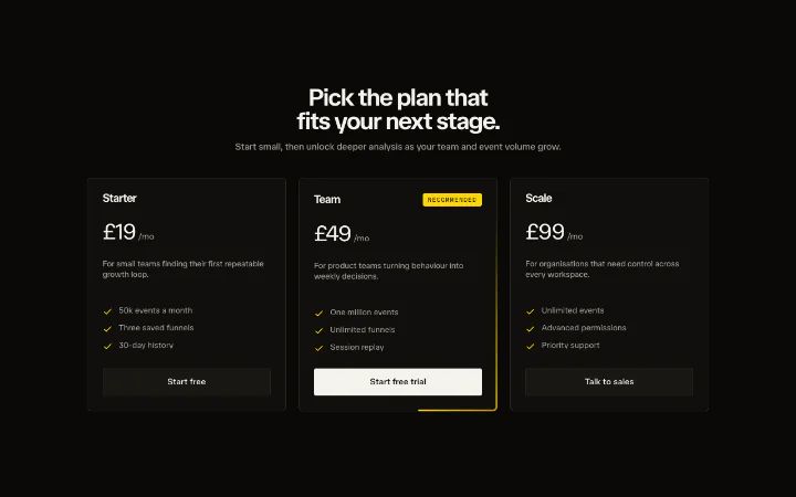
30 marketing sections composed from the components above. Install one and it adopts your theme.
Every section styles per your shadcn theme, via Tailwind.
Springs, durations, easings and stagger live in motion.theme.ts. Change it once and every section moves like your brand.
Install and adapt to any site via the Motion AI Kit, or via shadcn for tokenless installation.
Every component and section on this page comes with Motion+, on Solo and Pro alike. Pro adds hosted tools for teams.
One paymentSolo licence. Lifetime updates.