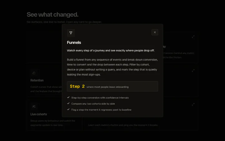
Expand card
An App Store-style expand where a grid tile morphs into a centred detail panel.
API reference
Components
<ExpandCards />
The provider/group for a set of expanding cards. It owns which card is open (openId), the reduced-motion decision every part reads, and the stable layoutId prefix that lets several groups coexist on one page. Renders no DOM of its own - drop it around your grid and its single ExpandCardPanel.
children?
Your grid of ExpandCardTriggers and the single ExpandCardPanel.
scrimOpacity?
Scrim opacity behind an open card (0-1). A visual constant, not global feel, so it stays a prop rather than a theme token. Defaults to 0.72.
<ExpandCardTrigger />
A grid tile that expands on activation. Renders a real <button> (correct keyboard + screen-reader semantics, aria-haspopup="dialog" and a live aria-expanded) wrapping the morphing surface that carries the shared layoutId. Hover/focus feedback is discrete colour only - style it via group-hover:*/group-focus-visible:* in className, the group class is already on the button.
id
The card's id - matched against openId and used to build the shared layoutIds so this tile morphs into the panel opened for the same id.
children?
Your card's visible content (an ExpandCardShared icon, a heading, a summary). Rendered inside the morphing surface.
className?
Merged onto the morphing surface - style the card face here (bg-card, border, padding, group-hover:* feedback, ...).
"aria-label"?
The button's accessible name (the tile's text is often abbreviated, so give the whole "Title. Summary. Open for detail." here).
<ExpandCardShared />
Marks a sub-element that morphs in tandem with its card's surface. It reads the card id from context (the trigger's own id, or the open panel's id), so you render the same part in both places and it flies between them. Under reduced motion it drops the layoutId and simply renders in place.
part
A stable name for this morphing part (e.g. "icon", "head"). Render one with the same part inside both the trigger and the panel and Motion flies it between them.
as?
Which element to render. Defaults to "span".
layout?
Pass "position" to animate only the element's position during the morph (never its size), which stops a text block from being scale-stretched while the surface resizes. Ignored under reduced motion.
className?
Merged onto the element - size and style the part here. The trigger and panel can style the same part differently; the morph handles the delta.
children?
The part's content.
<ExpandCardPanel />
The expanded detail dialog. There is exactly one per ExpandCards group; it renders nothing until a card opens, then mounts inside an AnimatePresence so it morphs in from the trigger and back out on close. It composes the shared overlay primitives - useFocusTrap (Tab cycle, Escape, focus restore to the trigger), useScrollLock (background scroll freeze) and Backdrop (the click-out scrim) - so the accessibility plumbing lives in one place, and wraps your content in a layout="position" element so the morph never distorts it.
children
The dialog body. A render function receiving the open card's id (so you can look up its content and build matching element ids) is the usual form; a plain node works when the body does not vary by card.
className?
Merged onto the dialog surface - the morphing box (bg-card, border, max-w-*, max-h-*, overflow-hidden, ...).
contentClassName?
Merged onto the inner layout="position" wrapper that holds your content (padding, gap, overflow-y-auto, ...). Kept separate from the surface so the position-only layout trick can sit between them.
labelledBy?
Builds the dialog's aria-labelledby from the open card's id - point it at the id you set on your title element.
describedBy?
Builds the dialog's aria-describedby from the open card's id.
initialFocusRef?
Where focus lands when the dialog opens. Defaults to the first focusable descendant (typically your close button); pass your close button's ref to be explicit.
<ExpandCardBody />
The dialog's non-shared body region. It cross-fades in AFTER the surface morph settles (delayed by the snap transition's own duration) so the detail text never appears while the box is still resizing. Under "calm" it fades in without travel; under "still" it appears instantly.
children?
The dialog's non-shared detail content.
className?
Merged onto the wrapper.
Hooks
useExpandCard
Read the expand/collapse controls from inside an ExpandCards group - use it to wire a dialog close button (onClick={close}) or drive the group from your own affordance.
useExpandCard(): UseExpandCardReturns
openId
The id of the currently expanded card, or null.
open
Expand the card with this id.
close
Collapse the open card.
isOpen
Whether the card with this id is the one currently expanded.
Featured in
See the expand card composed into full sections.