Overlay
Focus trap, scroll lock and dimming backdrop primitives for modals, sheets and palettes.
API reference
Components
<Backdrop />
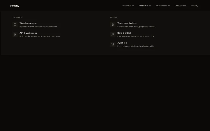
The dimming scrim behind an open overlay. A thin, unopinionated element: it paints the full-bleed surface and forwards your own entrance choreography (initial/animate/exit/transition) untouched, so a dialog can fade it in, a sheet can bind its opacity to a drag, and a view transition can animate it on its own layer, all from the same component. Wrap it in your AnimatePresence and pair it with useFocusTrap + useScrollLock.
opacity?
The scrim's opacity. A number for a plain fading dialog scrim (drive it with animate/exit), or a MotionValue<number> to bind opacity to something live - a sheet's drag position via useTransform, a view-transition layer - so the scrim dims in lockstep with the gesture. Merged into style, where a bound value wins over any animate opacity.
onClick?
Click-to-dismiss handler.
label?
When set, the scrim is itself the keyboard-reachable dismiss control: it renders as a real <button> carrying this aria-label (the bottom-sheet pattern). Omit it and the scrim renders aria-hidden decoration instead, in which case keyboard users dismiss via your Escape handler or an explicit close button.
className?
The scrim surface class. Defaults to bg-black - the universal modal scrim literal shadcn's own Dialog overlay uses, which dims correctly in both light and dark mode where a semantic token would invert. Pass your own section-local veil (e.g. a color-mix(in srgb, var(--background) 72%, transparent) class) to override it. absolute inset-0 is always applied.
style?
Extra inline styles, merged under opacity.
children?
Rarely needed - content rendered inside the scrim.
Hooks
useFocusTrap
Traps keyboard focus inside an open overlay. While active, Tab and Shift+Tab cycle between the first and last focusable descendants of container (never escaping to the page behind the scrim), Escape calls onEscape, and focus is moved into the panel on the next frame with preventScroll so a mount/layout animation is neither raced nor scrolled out of view. On release it restores focus to the element that had it before the overlay opened. Pair with aria-modal="true" on your panel and inert on the background; the trap is what makes those promises real.
useFocusTrap(options: FocusTrapOptions): voidactive
Whether the trap is engaged. Flipping this to true moves focus into container and starts cycling Tab; flipping it back to false releases the trap and (by default) restores focus to the trigger.
container
Ref to the overlay panel whose focusable descendants Tab cycles within - typically your role="dialog" element. Also mark the resting page content behind it inert + aria-hidden yourself so the overlay is the only thing in the tab order and a11y tree; that is a render concern on your own background element, not something a hook can reach.
onEscape?
Called when Escape is pressed while the trap is active. Wire it to your close handler.
initialFocus?
Ref to the element focused when the trap engages. Defaults to the first focusable descendant, falling back to the container. Pass your close button's ref to open focus there (the command-palette / sheet pattern).
restoreFocus?
Whether to return focus to whatever was focused before the trap engaged (usually the trigger) when it releases. Defaults to true.
useScrollLock
Freezes background scroll while active, by setting overflow: hidden on document.documentElement, and restores the previous value when it flips off or the component unmounts. Guard-free on the server (no-op when there is no document). Call it alongside useFocusTrap so the page behind an open overlay can neither scroll nor be tabbed into.
useScrollLock(active: boolean): voidFunctions
getFocusableElements
Returns the tabbable descendants of container, in document order. The focus trap uses this to find the ends of the cycle; a consumer can call it directly to move focus into an overlay manually. Returns an empty array for a null container (an unmounted panel), so callers never need a null guard.
getFocusableElements(container: HTMLElement | null): HTMLElement[]Featured in
See the overlay composed into full sections.