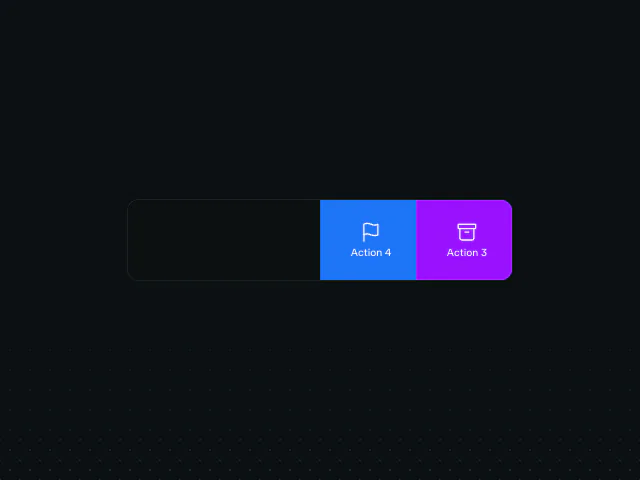
Swipe actions
A list row that follows a swipe to reveal actions, and commits on a full flick.
API reference
Components
<SwipeActionsList />
The list container: coordinates single-open state across its rows (opening one closes any other). A LayoutGroup keeps the layout-aware <motion.ul> and row items in the same measurement pass, while AnimatePresence mode="popLayout" removes a committed row from flow so its surviving siblings translate into place cleanly.
children?
The SwipeActions rows (keyed by their stable id), and optionally an empty-state child when the list is exhausted.
className?
Merged onto the <ul> - this is where the list look lives (a bordered rounded-lg border border-border bg-card card, or your own). The structural relative w-full overflow-hidden is always applied.
style?
Inline styles merged onto the <ul> - a maxWidth for the column typically lives here.
ref?
Forwarded to the <ul> (React 19 ref-as-prop).
<SwipeActions />
One swipeable row. Owns the pointer/drag machinery, the spring follow and the thresholds; renders the face over two action groups and provides the swipe context every SwipeAction (and the face's useSwipeRow) reads.
id
Stable id for this row: its single-open key. Required.
children?
The row FACE - the resting content that slides over the actions. It sits on an opaque bg-card layer the row draws; render your own row here and read useSwipeRow() inside it to de-emphasise as the swipe crosses.
left?
The SwipeActions revealed by swiping the row RIGHT (they live off the left edge). Give each side="left".
right?
The SwipeActions revealed by swiping the row LEFT (they live off the right edge). Give each side="right".
rowHeight?
Row height in px. Defaults to 88.
revealThreshold?
Fraction of the row a swipe must clear to snap open on release (0..1). Defaults to 0.25.
fullSwipeThreshold?
Fraction of the row a swipe must clear to commit a full swipe (0..1). Defaults to 0.8.
revealAmount?
How far the row snaps open on release, as a fraction of its width (0..1). Defaults to 0.5.
index?
This row's position in the list, for the entrance stagger. Defaults to 0.
isLast?
Drop the bottom divider on the last row. Defaults to false.
className?
Merged onto the row <li>.
<SwipeAction />
A single revealed action. The icon + label spring through an elastic offset/scale as the swipe crosses the threshold; a secondary action fades out near full swipe so it never overlaps the primary, and the primary slides to the outer edge and snaps to fill. Reads the row's swipe state from the enclosing SwipeActions.
icon
The action glyph, e.g. a line-icon <svg>. Sized/coloured by you; fillClassName's text-* colour flows through a currentColor icon.
label
The short action label, rendered under the icon.
side
Which edge this action lives on - must match the slot (left/right) of SwipeActions it is passed to.
primary?
The outer action on its side: it slides to the edge as the swipe crosses and snaps to fill the row on a full swipe, and it is the one a full swipe commits. Exactly one action per side should be primary. Defaults to false.
fillClassName
The fill + text classes for this action's box, e.g. "bg-destructive text-destructive-foreground". Colour is a demo/consumer decision, never baked into the mechanic.
ariaLabel
The button's accessible label (the icon is decorative).
onActivate
Fired when the action is tapped, and - for a primary action - when a full swipe commits its side. A secondary action snaps the row shut first; a primary action leaves the row as is (typically its consumer removes the row in response).
Hooks
useSwipeRow
Read the enclosing row's live swipe state from a face rendered as SwipeActions children. A face uses progress to de-emphasise itself as the actions come in (e.g. fading its content), spring to settle that response on the same curve the row follows, and flat to drop the response entirely under reduced motion. Must be called inside a SwipeActions row.
useSwipeRow(): SwipeRowStateReturns
progress
The row's live swipe progress, in [-1, 1] (see SwipeRowContextValue).
spring
The snap spring the row follows with.
flat
True under reduced motion - drop decorative swipe-driven flourishes.