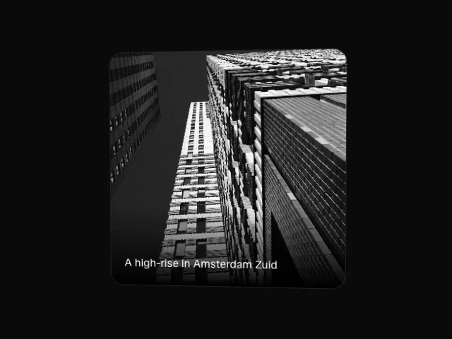
Tilt card
A card that leans toward the pointer in 3D, on compositor transforms only.
API reference
Components
<TiltCard />
Tile that leans towards the pointer with entrance/tilt split across two elements.
item
Entrance variant for the outer element.
interactive
Whether the tilt and micro-interaction hooks are live.
maxTilt
Maximum pointer-tilt swing, in degrees.
outerClassName?
Merged onto the outer element.
className?
Merged onto the inner tilting element.
href?
When set, the inner element is a real <a href>.
target?
Anchor target. Only meaningful with href.
rel?
Anchor rel. Only meaningful with href.
onHoverStart?
Hover-start callback for the <div> form. Ignored when href is set.
whileHover?
Drives descendant ArrowNudge instances on hover/focus. Only meaningful with href.
whileFocus?
Reserved for API symmetry with anchor gesture wiring.
children
The card's content.
Hooks
usePointerTilt
Pointer-tilt mechanic for composing onto an element you already own.
usePointerTilt(maxTilt: number, interactive: boolean): PointerTiltReturns
ref
Callback ref for the tilting element.
style
rotateX / rotateY springs plus perspective. undefined when not interactive.
onPointerMove
Pointer-move handler. undefined when not interactive.
onPointerLeave
Pointer-leave handler. undefined when not interactive.
Featured in
See the tilt card composed into full sections.