Motion UIComponentsComponent

Hold to confirm

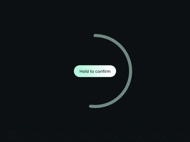
A press-and-hold button that wipes a destructive fill across the label as you confirm.

npx shadcn@latest add @motion/hold-to-confirm

API reference

Components

<HoldToConfirmButton />

The finished destructive hold button: a resting bg-secondary pill whose label is wiped left-to-right by an opaque bg-destructive fill as the hold advances, paired with a slow scale-down. One fill, no competing ring - the sole progress signal. Drives itself off useHoldToConfirm.

holdSeconds?

number = 2

Seconds the button must be held to confirm. Default 2.

mode?

"callback" | "success" = "callback"

What happens visually after confirmation. "callback" leaves the completed state to the consumer, which can replace surrounding content. "success" keeps the button mounted and wipes its success state in from the left. Default "callback".

successLabel?

ReactNode = "Confirmed"

Label shown beside the built-in check in "success" mode. Default "Confirmed".

onConfirm?

() => void

Fired once the hold completes. Flip your own confirmed state here.

onCancel?

() => void

Fired when the hold is released early.

children?

ReactNode

The button label (typically an icon + text). Rendered in BOTH the resting layer and the clipped destructive fill layer, so it is legible at every point of the wipe.

className?

string

Merged onto the button element.

"aria-describedby"?

string

Points at the consumer's own hint/instruction text, wired through to the button's aria-describedby.

Hooks

useHoldToConfirm

Headless press-and-hold: owns the progress MotionValue and the whole gesture, leaving the surface (and what progress drives) entirely to the consumer.

useHoldToConfirm(options: UseHoldToConfirmOptions): UseHoldToConfirmResult

holdSeconds?

number = 2

Seconds the gesture must be held for progress to reach 1 and confirm. Default 2.

onConfirm?

() => void

Fired once when a hold completes (progress reaches 1). Update your own confirmed/committed state here.

onCancel?

() => void

Fired when a hold is released before it completes (the retract).

Returns

progress

MotionValue<number>

The single source of truth: 0 at rest, 1 confirmed. Drive any animation off it (a fill wipe, a scale, a ring) with useTransform.

reset

() => void

Stop any in-flight ramp and snap progress back to 0, clearing the completed lock so the gesture can run again.

holdHandlers

{ onPointerDown: (event: React.PointerEvent<HTMLButtonElement>) => void onPointerUp: (event: React.PointerEvent<HTMLButtonElement>) => void onPointerCancel: (event: React.PointerEvent<HTMLButtonElement>) => void onPointerLeave: (event: React.PointerEvent<HTMLButtonElement>) => void onKeyDown: (event: React.KeyboardEvent<HTMLButtonElement>) => void onKeyUp: (event: React.KeyboardEvent<HTMLButtonElement>) => void onContextMenu: (event: React.MouseEvent<HTMLButtonElement>) => void }

Spread onto the interactive element (a <button>): pointer-capture hold, release-to-cancel, and Space-key hold, plus a context-menu guard so a long-press does not open the OS callout.

Related examples