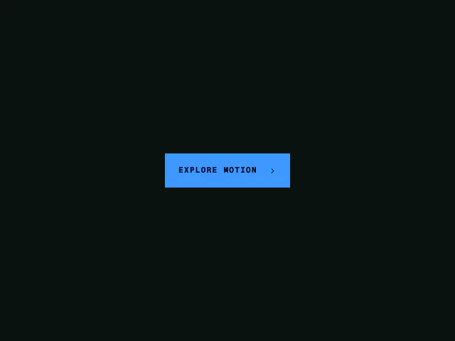
Rolling text button
A button label that rolls as a whole or character by character on hover or keyboard focus.
API reference
Components
<RollingTextButton />
A clipped two-copy label rollover. Hover or keyboard focus shifts the label stack by exactly one line, making the duplicate replace the original without changing the button's dimensions. Reduced motion leaves one copy in place.
children
The button label. It is duplicated visually for the rolling effect, while the button itself keeps one accessible name.
direction?
Direction the incoming label travels. "down" (default) rolls a copy in from above; "up" rolls a copy in from below.
staggerCharacters?
Split both visual copies into characters and roll each character separately. Defaults to false, which moves the complete label at once.
staggerMultiplier?
Multiplier applied to the theme's tight stagger when staggerCharacters is enabled. Defaults to 1.
type?
Button type. Defaults to "button".
disabled?
Disables hover, focus and click interactions.
onClick?
Click handler.
"aria-label"?
Accessible name override. Defaults to children.
className?
Merged onto the button root. Apply the surface, shape and spacing here.
Functions
createPlaythroughController
Keeps the current state latched while its animation is running. Any reversal is queued, then applied only after completeAnimation.
createPlaythroughController(onChange: (active: boolean) => void): PlaythroughControllerReturns
request
completeAnimation
reset
Featured in
See the rolling text button composed into full sections.