Motion UIComponentsComponent

Accordion

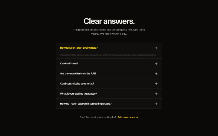
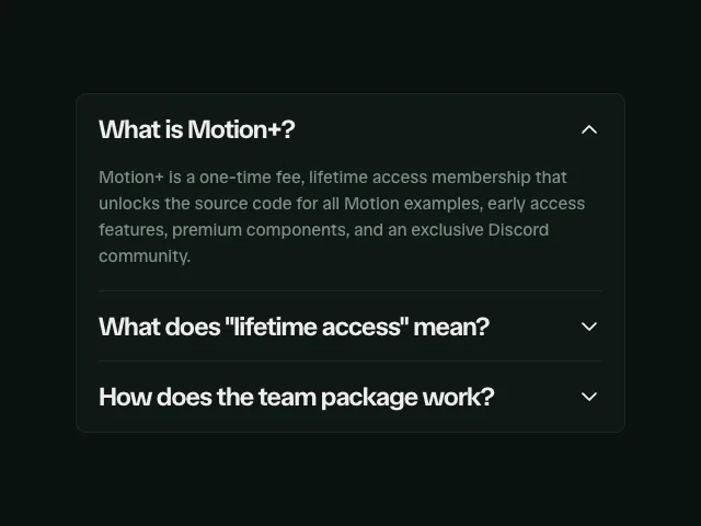
Springy height-morph accordion panels that fold open with a blur-in on the copy.

npx shadcn@latest add @motion/accordion

API reference

Components

<Accordion />

The accordion root: Base UI's Accordion.Root (open state, toggling, keyboard navigation between triggers) plus Motion UI's deep-linking. The root is held controlled internally so a URL fragment can reveal a row; pass value/onValueChange to control it yourself. Renders a single container element whose look is entirely your className.

multiple?

boolean = false

Whether multiple rows can be open at once. Defaults to false (classic one-open-at-a-time accordion) - the same prop, name and default as Base UI's Accordion.Root.

defaultValue?

string[]

The values open on first render (uncontrolled). Base UI vocabulary: an array, even under single-open.

value?

string[]

The controlled open values. Omit (and optionally set defaultValue) to let the accordion manage itself.

onValueChange?

(value: string[]) => void

Called with the next open values whenever a row is toggled.

deepLink?

boolean = false

Wire deep-linking: open and scroll to the row whose value matches the URL fragment, on mount and on hashchange. Defaults to false.

className?

string

Merged onto the container element - this is where the container look lives: a bordered overflow-hidden rounded-lg border bg-card card, a chromeless border-t hairline list, or your own.

children?

ReactNode

The AccordionItem rows.

<AccordionItem />

One disclosure row: Base UI's Accordion.Item rendered as a motion.div, so entrance props (variants, ...) a consumer's stagger passes through land on the row. Base UI owns the trigger<->panel aria wiring; this wrapper only exposes the row's open state to the Motion layers and carries value as the deep-link anchor.

value

string

Stable value for this row: its open-state key (Base UI vocabulary) AND its deep-link anchor id (a link to #{value} opens and scrolls to it). Required.

className?

string

Merged onto the row element - a per-row divider (border-b) lives here.

children?

ReactNode

The row's AccordionTrigger and AccordionPanel.

<AccordionTrigger />

The accessible trigger: Base UI's Accordion.Header + Accordion.Trigger (a real <button aria-expanded aria-controls> in a heading, with Arrow key/Home/End navigation between rows), dressed with the theme's snap-timed hover colour and the shared focus ring, plus the indicator slot.

children?

ReactNode

The trigger label. Wrap it in your own <span> to size/weight it (text-base font-medium text-balance); the trigger only lays it out.

indicator?

ReactNode

The open/closed indicator, rendered after the label. Defaults to <AccordionChevron />; pass <AccordionPlusMinus /> or your own mark.

className?

string

Merged onto the <button> - trigger padding (px-6 py-5) lives here.

headingLevel?

2 | 3 | 4 | 5 | 6 = 3

The heading level wrapping the button, for document outline correctness. Defaults to 3 (Base UI's own default).

inset?

boolean = false

Use the inset focus ring instead of the offset one - set this when the accordion sits inside an overflow-hidden card that would clip an offset ring on the first/last row. Defaults to false.

<AccordionPanel />

The collapsible panel: Base UI's Accordion.Panel (role="region" labelled by its trigger, hidden when closed at rest) with Motion's height 0 <-> auto spring, fold mask and inner blur-in inside. keepMounted keeps the region in the DOM so AnimatePresence can run the exit collapse; the [&[hidden]]:block override keeps that exit visible while Base UI has already marked the panel hidden (the pattern from Motion's own Base UI example). Under reduced motion it snaps open with an opacity-only fade.

children?

ReactNode

The disclosed content (typically a <p>).

className?

string

Merged onto the inner content wrapper - panel padding (px-6 pt-1 pb-6) lives here. The outer collapsible owns overflow-hidden and contain: layout and is not stylable, so padding never fights the height morph.

<AccordionChevron />

A chevron that rotates 0 <-> 180 on the theme's snap transition as the row opens. Decorative (aria-hidden); the trigger's aria-expanded carries the state to assistive tech. The default AccordionTrigger indicator.

open?

boolean

Force the open/closed state. Omit inside an AccordionItem and the indicator reads the row's state itself.

className?

string

Merged onto the indicator. The default tone is text-muted-foreground.

<AccordionPlusMinus />

A plus that morphs into a minus as the row opens. Two currentColor bars share one centred origin: the vertical bar spins 90 -> 0 (closing the "+" into a "-") while the horizontal bar spins 0 -> 180 on the same snap spring, so the collapse reads as one coordinated move. Decorative (aria-hidden).

open?

boolean

Force the open/closed state. Omit inside an AccordionItem and the indicator reads the row's state itself.

className?

string

Merged onto the indicator. The default tone is text-muted-foreground.

Hooks

useAccordionHash

Headless deep-linking. Reads the URL fragment on mount and whenever the hash changes, calls onMatch with the id when it points at a known row, and scrolls that row into view (smooth unless the user prefers reduced motion). Runs in an effect, so it never touches window during render and cannot cause a hydration mismatch. Accordion calls this for you when deepLink is set; call it yourself only when you drive your own open state.

useAccordionHash(options: UseAccordionHashOptions): void

onMatch

(id: string) => void

Called with the matched fragment id on mount and on every hashchange, so you can open that row. Reveal, never toggle - a fragment opens its target, it does not close an already-open one.

ids?

readonly string[]

Restrict matches to these ids. Omit to honour any fragment that points at an element on the page.

enabled?

boolean = true

Turn the listener off (a section with no deep-link support). Defaults to true.

Functions

nextOpenIds

The toggle transition: flip value's open state within current. Under singleOpen a newly opened row is the only open row (opening one collapses the rest); otherwise rows open independently. Matches Base UI's own toggling, for consumers driving a controlled value themselves.

nextOpenIds(current: string[], value: string, singleOpen: boolean): string[]

revealOpenIds

The reveal transition: ensure value is open (used by deep-linking, where a fragment should open its target, never close it). Under singleOpen the revealed row becomes the only open row; otherwise it is added to the set.

revealOpenIds(current: string[], value: string, singleOpen: boolean): string[]

Related examples