"use client"

import * as motion from "motion/react-client"
import { useState } from "react"

export default function StateAnimations() {
    const [x, setX] = useState(0)
    const [y, setY] = useState(0)
    const [rotate, setRotate] = useState(0)

    return (
        <div id="example">
            <div>
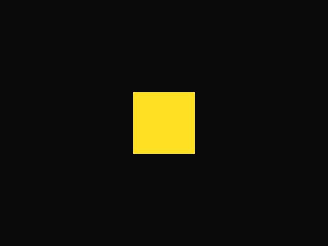
                <motion.div
                    className="box"
                    animate={{ x, y, rotate }}
                    transition={{ type: "spring" }}
                />
            </div>
            <div className="inputs">
                <Input value={x} set={setX}>
                    x
                </Input>
                <Input value={y} set={setY}>
                    y
                </Input>
                <Input value={rotate} set={setRotate} min={-180} max={180}>
                    rotate
                </Input>
            </div>
            <StyleSheet />
        </div>
    )
}

interface InputProps {
    children: string
    value: number
    set: (newValue: number) => void
    min?: number
    max?: number
}

function Input({ value, children, set, min = -200, max = 200 }: InputProps) {
    return (
        <label>
            <code>{children}</code>
            <input
                value={value}
                type="range"
                min={min}
                max={max}
                onChange={(e) => set(parseFloat(e.target.value))}
            />
            <input
                type="number"
                value={value}
                min={min}
                max={max}
                onChange={(e) => set(parseFloat(e.target.value) || 0)}
            />
        </label>
    )
}

/**
 * ==============   Styles   ================
 */

function StyleSheet() {
    return (
        <style>{`
            #example .box {
                width: 200px;
                height: 200px;
                border-radius: 20px;
                border: 5px dotted var(--hue-1);
                pointer-events: none;
            }

            #example {
                display: flex;
                align-items: center;
            }

            #example input {
                accent-color: var(--hue-1);
                font-family: "Geist Mono", monospace;
            }

            #example .inputs {
                display: flex;
                flex-direction: column;
                padding-left: 50px;
            }

            #example label {
                display: flex;
                align-items: center;
                margin: 10px 0;
            }

            #example label code {
                width: 100px;
            }

            #example input[type="number"] {
                border: 0;
                border-bottom: 1px dotted var(--hue-1);
                color: var(--hue-1);
                margin-left: 10px;
            }

            #example input[type="number"]:focus {
                outline: none;
                border-bottom: 2px solid var(--hue-1);
            }

            #example input[type="number"]::-webkit-inner-spin-button {
                -webkit-appearance: none;
            }

            input[type='range']::-webkit-slider-runnable-track {
                height: 10px;
                -webkit-appearance: none;
                background: var(--layer);
                border: 1px solid var(--border);
                border-radius: 10px;
                margin-top: -1px;
            }

            input[type='range']::-webkit-slider-thumb {
                -webkit-appearance: none;
                height: 20px;
                width: 20px;
                border-radius: 50%;
                background: var(--hue-1);
                top: -4px;
                position: relative;
            }
        `}</style>
    )
}

 Drag
Drag