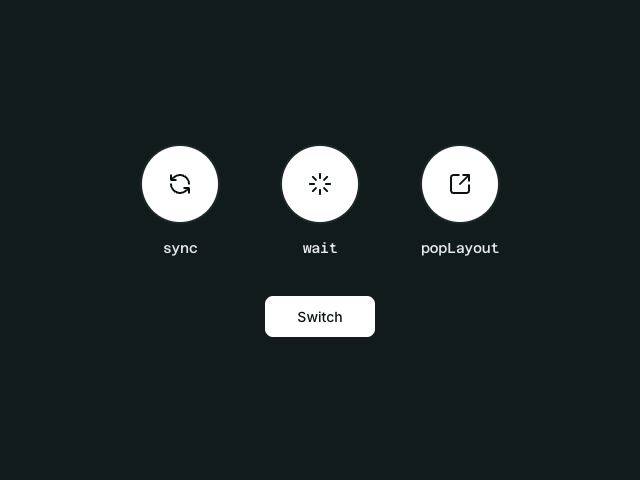
AnimatePresence modes
An example of the three AnimatePresence modes (sync, wait, and popLayout) demonstrating how elements enter and exit the DOM with Motion for Vue.

Source code
<script setup lang="tsx">
/** @jsxImportSource vue */
import { AnimatePresence, motion } from 'motion-v'
import { defineComponent, ref, computed } from 'vue'

const ModeExample = defineComponent({
  props: {
    mode: {
      type: String as () => 'sync' | 'wait' | 'popLayout',
      required: true
    },
    icon: {
      type: Object,
      required: true
    },
    state: {
      type: Boolean,
      required: true
    }
  },
  setup(props) {
    const defaultEase = [0.26, 0.02, 0.23, 0.94]
    const motionProps = computed(() => ({
      class: ['base-circle', props.state ? 'active' : 'inactive'],
      initial: { opacity: 0, scale: 0.6 },
      animate: {
        opacity: 1,
        scale: 1,
        ease: props.mode === 'wait' ? [0.02, 0.35, 0.25, 0.99] : defaultEase,
      },
      exit: {
        opacity: 0,
        scale: 0.8,
        ease: props.mode === 'wait' ? [0.46, 0.04, 0.97, 0.44] : defaultEase,
      },
      transition: { duration: 0.3 },
    }))

    return () => (
      <div class="mode-section">
        <div class="icon-container">
          <AnimatePresence mode={props.mode}>
            <motion.div key={String(props.state)} {...motionProps.value}>
              {props.icon}
            </motion.div>
          </AnimatePresence>
        </div>
        <code class="mode-title">{props.mode}</code>
      </div>
    )
  }
})

const state = ref(true)

function switchItems() {
  state.value = !state.value
}

function SyncIcon() {
  return (
    <svg
      width="24"
      height="24"
      viewBox="0 0 24 24"
      fill="none"
      stroke="currentColor"
      stroke-width="2"
      stroke-linecap="round"
      stroke-linejoin="round"
    >
      <path d="M21 12a9 9 0 0 0-9-9 9.75 9.75 0 0 0-6.74 2.74L3 8" />
      <path d="M3 3v5h5" />
      <path d="M3 12a9 9 0 0 0 9 9 9.75 9.75 0 0 0 6.74-2.74L21 16" />
      <path d="M16 16h5v5" />
    </svg>
  )
}

function WaitIcon() {
  return (
    <svg
      width="24"
      height="24"
      viewBox="0 0 24 24"
      fill="none"
      stroke="currentColor"
      stroke-width="2"
      stroke-linecap="round"
      stroke-linejoin="round"
    >
      <path d="M12 2v4" />
      <path d="m16.2 7.8 2.9-2.9" />
      <path d="M18 12h4" />
      <path d="m16.2 16.2 2.9 2.9" />
      <path d="M12 18v4" />
      <path d="m4.9 19.1 2.9-2.9" />
      <path d="M2 12h4" />
      <path d="m4.9 4.9 2.9 2.9" />
    </svg>
  )
}

function PopLayoutIcon() {
  return (
    <svg
      width="24"
      height="24"
      viewBox="0 0 24 24"
      fill="none"
      stroke="currentColor"
      stroke-width="2"
      stroke-linecap="round"
      stroke-linejoin="round"
    >
      <path d="M21 13v6a2 2 0 0 1-2 2H5a2 2 0 0 1-2-2V5a2 2 0 0 1 2-2h6" />
      <path d="m21 3-9 9" />
      <path d="M15 3h6v6" />
    </svg>
  )
}
</script>

<template>
  <div class="container">
    <div class="modes-container">
      <ModeExample mode="sync" :icon="SyncIcon()" :state="state" />
      <ModeExample mode="wait" :icon="WaitIcon()" :state="state" />
      <ModeExample mode="popLayout" :icon="PopLayoutIcon()" :state="state" />
    </div>

    <motion.button
      class="button"
      @click="switchItems"
      :whileTap="{ scale: 0.95 }"
    >
      Switch
    </motion.button>
  </div>
</template>

<style>
/**
 * ==============   Styles   ================
 */

.container {
  display: flex;
  flex-direction: column;
  align-items: center;
  gap: 40px;
  color: #f5f5f5;
  border-radius: 12px;
}

.modes-container {
  display: flex;
  gap: 60px;
  justify-content: center;
  align-items: center;
  width: 100%;
}

.mode-section {
  display: flex;
  flex-direction: column;
  align-items: center;
  gap: 16px;
}

.icon-container {
  width: 80px;
  height: 80px;
  position: relative;
  display: flex;
  align-items: center;
  justify-content: center;
  flex-direction: column;
}

.mode-title {
  font-size: 14px;
  font-weight: 500;
  color: #f5f5f5;
  opacity: 0.9;
}

.button {
  background-color: #f5f5f5;
  color: #0f1115;
  border: none;
  border-radius: 8px;
  padding: 12px 32px;
  font-size: 14px;
  font-weight: 500;
  cursor: pointer;
  outline: none;
}

.base-circle {
  width: 80px;
  height: 80px;
  border-radius: 50%;
  display: flex;
  align-items: center;
  justify-content: center;
  will-change: transform;
  box-sizing: border-box;
  flex-shrink: 0;
}

.base-circle.active {
  background-color: #f5f5f5;
  color: #0f1115;
  border: 2px solid #1d2628;
}

.base-circle.inactive {
  background-color: transparent;
  color: #f5f5f5;
  border: 2px solid #f5f5f5;
}
</style>