"use client"
import { useCallback, useEffect, useId, useState } from "react"
import { AnimatePresence, motion, MotionConfig, resize } from "motion/react"
/* The complete sign-in-or-up flow, combining the conditional password
* field and the card-stack verification step into one animated surface.
* The auth logic is mocked so the demo runs standalone: submitting an
* email reveals the password field (the "create your account" path),
* and submitting again stacks up the one-time-code card. Wire the same
* UI to Clerk's useSignIn()/useSignUp() hooks for a real custom flow. */
const SIGN_IN_VARIANTS = {
default: { opacity: 1, scale: 1, y: 0, x: "-50%" },
verifying: { opacity: 0.6, scale: 0.95, y: -10, x: "-50%" },
}
const VERIFY_VARIANTS = {
default: { opacity: 0, y: 100, x: "-50%" },
verifying: { opacity: 1, y: 0, x: "-50%" },
}
const TEXT_VARIANTS = {
initial: { opacity: 0, filter: "blur(10px)", y: -10 },
animate: { opacity: 1, filter: "blur(0px)", y: 0 },
exit: { opacity: 0, filter: "blur(10px)", y: 10 },
}
const wait = (ms: number) => new Promise<void>((resolve) => setTimeout(resolve, ms))
function Spinner({ size = 12 }: { size?: number }) {
return (
<div style={{ width: size, height: size }}>
<div className="spinner" style={{ width: size, height: size }}>
{Array.from({ length: 12 }).map((_, i) => (
<div
key={i}
className="spinner__bar"
style={{
transform: `rotate(${i * 30}deg) translate(146%)`,
animationDelay: `-${1.2 - i * 0.1}s`,
}}
/>
))}
</div>
</div>
)
}
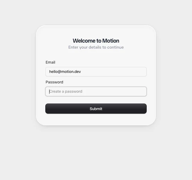
function ConditionalField({
open,
label,
error,
...props
}: React.ComponentProps<"input"> & { open: boolean; label: string; error?: string | null }) {
const [height, setHeight] = useState(0)
const internalId = useId()
const id = props.id || internalId
const measureRef = useCallback((el: HTMLDivElement | null) => {
if (!el) return
return resize(el, (_, { height }) => setHeight(height))
}, [])
return (
<motion.div animate={{ height: open ? height : 0 }} style={{ willChange: "height" }}>
<div ref={measureRef} style={{ position: "relative" }}>
<AnimatePresence mode="popLayout">
{open && (
<motion.div
key="password-field"
className="auth__field"
initial={{ opacity: 0, y: -8 }}
animate={{ opacity: 1, y: 0 }}
exit={{ opacity: 0, y: 0 }}
style={{ marginTop: "0.75rem" }}
>
<label htmlFor={id}>{label}</label>
<input autoFocus {...props} id={id} />
{error && <p className="auth__field-error">{error}</p>}
</motion.div>
)}
</AnimatePresence>
</div>
</motion.div>
)
}
function OTPInput({ length = 6, autoFocus }: { length?: number; autoFocus?: boolean }) {
const [code, setCode] = useState("")
const activeIndex = Math.min(code.length, length - 1)
return (
<div className="otp">
<input
className="otp__input"
value={code}
onChange={(e) => setCode(e.target.value.replace(/\D/g, "").slice(0, length))}
inputMode="numeric"
autoComplete="one-time-code"
aria-label="Verification code"
autoFocus={autoFocus}
/>
<div className="otp__slots" aria-hidden="true">
{Array.from({ length }).map((_, i) => (
<div key={i} className="otp__slot" data-active={i === activeIndex}>
{code[i] ?? ""}
</div>
))}
</div>
</div>
)
}
function ResendButton(props: React.ComponentProps<"button">) {
const [countdown, setCountdown] = useState(30)
useEffect(() => {
const id = setInterval(() => setCountdown((prev) => (prev <= 0 ? prev : prev - 1)), 1000)
return () => clearInterval(id)
}, [])
return (
<button {...props} type="button" className="resend" disabled={countdown > 0}>
Didn't receive a code? Resend {countdown > 0 ? `(${countdown})` : ""}
</button>
)
}
function SignIn({ onVerify }: { onVerify: () => void }) {
const [emailAddress, setEmailAddress] = useState("")
const [password, setPassword] = useState("")
const [showPassword, setShowPassword] = useState(false)
const [loading, setLoading] = useState(false)
useEffect(() => {
if (!showPassword) return
const handleKeyUp = (e: KeyboardEvent) => {
if (e.key === "Escape") {
e.preventDefault()
setPassword("")
setShowPassword(false)
}
}
window.addEventListener("keyup", handleKeyUp)
return () => window.removeEventListener("keyup", handleKeyUp)
}, [showPassword])
const handleSubmit = async (e: React.FormEvent) => {
e.preventDefault()
setLoading(true)
await wait(650)
setLoading(false)
/* No password yet: in the real flow Clerk returns
* `form_identifier_not_found` for an unknown email, so we reveal
* the password field to create an account. With a password set,
* we advance to verification. */
if (!showPassword) {
setShowPassword(true)
} else {
onVerify()
}
}
return (
<motion.div variants={SIGN_IN_VARIANTS} className="auth__card" initial="default">
<AnimatePresence initial={false} mode="popLayout">
{!showPassword ? (
<motion.h3
key="sign-in-title"
className="auth__card-title"
variants={TEXT_VARIANTS}
initial="initial"
animate="animate"
exit="exit"
>
Welcome to Motion
</motion.h3>
) : (
<motion.h3
key="sign-up-title"
className="auth__card-title"
variants={TEXT_VARIANTS}
initial="initial"
animate="animate"
exit="exit"
>
Create your account
</motion.h3>
)}
</AnimatePresence>
<p className="auth__card-description">Enter your details to continue</p>
<form onSubmit={handleSubmit}>
<div className="auth__field">
<label htmlFor="email">Email address</label>
<input
id="email"
name="email"
type="email"
required
placeholder="Enter your email address"
value={emailAddress}
onChange={(e) => setEmailAddress(e.target.value)}
/>
</div>
<ConditionalField
label="Password"
name="password"
id="password"
type="password"
placeholder="Create a password"
required
onBlur={({ target }) => setShowPassword(target.value.length > 0)}
onChange={(e) => setPassword(e.target.value)}
value={password}
open={showPassword}
/>
<button className="btn btn--primary" style={{ marginTop: "1.5rem" }} type="submit" disabled={loading}>
{loading ? <Spinner size={12} /> : <span>Continue</span>}
</button>
</form>
</motion.div>
)
}
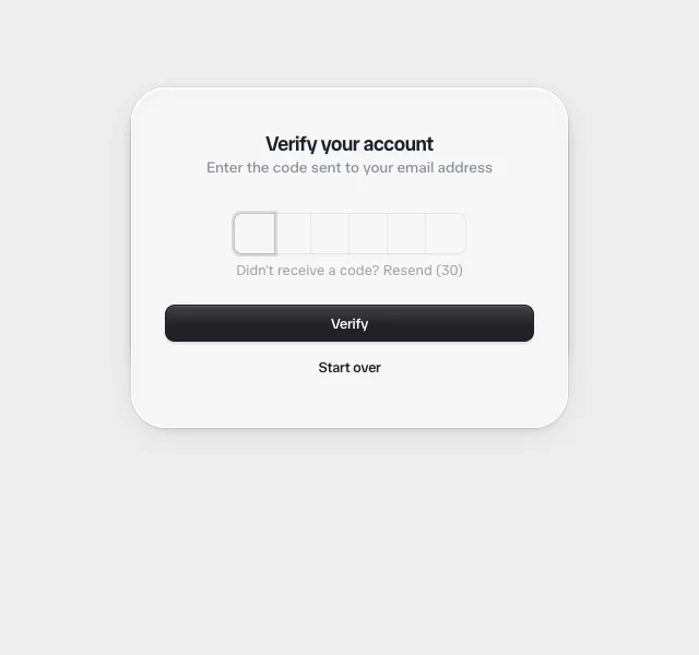
function Verify({ onCancel, onComplete }: { onCancel: () => void; onComplete: () => void }) {
const [loading, setLoading] = useState(false)
const handleSubmit = async (e: React.FormEvent) => {
e.preventDefault()
setLoading(true)
await wait(650)
setLoading(false)
onComplete()
}
return (
<motion.div
className="auth__card auth__card--overlay"
variants={VERIFY_VARIANTS}
initial="default"
animate="verifying"
exit="default"
>
<h3 className="auth__card-title">Verify your account</h3>
<p className="auth__card-description">Enter the code sent to your email address</p>
<form onSubmit={handleSubmit}>
<div className="auth__field" style={{ width: "min-content", marginInline: "auto" }}>
<OTPInput autoFocus length={6} />
</div>
<ResendButton style={{ marginInline: "auto", marginTop: "0.5rem" }} />
<button className="btn btn--primary" style={{ marginTop: "1.5rem" }} type="submit" disabled={loading}>
{loading ? <Spinner size={12} /> : <span>Verify</span>}
</button>
</form>
<button className="btn" onClick={onCancel} type="button" style={{ marginTop: "0.5rem" }}>
Start over
</button>
</motion.div>
)
}
export default function ClerkSignIn() {
const [isVerifying, setIsVerifying] = useState(false)
/* Remount the sign-in card on reset so its internal email/password
* state clears, mirroring signIn.reset()/signUp.reset(). */
const [resetKey, setResetKey] = useState(0)
const reset = () => {
setIsVerifying(false)
setResetKey((k) => k + 1)
}
return (
<MotionConfig transition={{ type: "spring", bounce: 0.3, visualDuration: 0.4 }}>
<motion.div animate={isVerifying ? "verifying" : "default"} className="clerk-stage">
<div className="auth__root">
<div className="auth__card-container">
<SignIn key={resetKey} onVerify={() => setIsVerifying(true)} />
<AnimatePresence mode="popLayout">
{isVerifying && <Verify onCancel={reset} onComplete={reset} />}
</AnimatePresence>
</div>
</div>
<style>{`
.clerk-stage {
--surface: #f7f7f8;
color-scheme: light;
position: relative;
align-self: stretch;
flex: 1 1 auto;
width: 100%;
min-height: 100%;
overflow: auto;
background: #ededed;
color: #212126;
font-family: system-ui, -apple-system, BlinkMacSystemFont, "Segoe UI", Roboto, Helvetica, Arial, sans-serif;
}
.clerk-stage, .clerk-stage * { box-sizing: border-box; }
.auth__root {
display: grid;
justify-content: center;
align-items: flex-start;
min-height: 100%;
padding: clamp(2rem, 14vh, 6rem) 1rem 2rem;
}
.auth__card-container {
position: relative;
grid-column: 1;
grid-row: 1;
}
.auth__card {
position: absolute;
left: 50%;
width: 25rem;
max-width: calc(100vw - 2rem);
transform: translateX(-50%);
padding: 2.5rem 2rem;
background-color: var(--surface);
border-radius: 2rem;
transform-origin: top center;
box-shadow:
inset 0 0 0 1px rgb(255 255 255),
inset 0 2px 4px 0 rgb(255 255 255),
inset 0 4px 10px 0 hsl(0 0 0 / 0.05),
0 4px 14px -10px hsl(0 0 0 / 0.4),
0 8px 28px -10px hsl(0 0 0 / 0.1),
0 0 0 1px rgb(0 0 0 / 0.06);
}
.auth__card--overlay { z-index: 10; }
.auth__card button { width: 100%; }
.auth__card form { margin-top: 2rem; }
.auth__card-title {
text-align: center;
font-size: 1.125rem;
line-height: 1.5rem;
font-weight: 600;
letter-spacing: -0.025em;
}
.auth__card-description {
text-align: center;
font-size: 0.875rem;
line-height: 1.25rem;
opacity: 0.72;
}
.auth__field {
display: flex;
flex-direction: column;
gap: 0.5rem;
}
.auth__field-error {
color: #ff3300;
font-size: 0.75rem;
line-height: 1rem;
}
.auth__field label {
font-size: 0.8125rem;
line-height: 1rem;
font-weight: 500;
}
.auth__field input {
--border-color: rgb(0 0 0 / 0.1);
--ring: 0 0 0 0px rgb(0 0 0 / 0);
width: 100%;
border-radius: 0.375rem;
background-color: var(--surface);
padding: 0.375rem 0.75rem;
font-size: 0.8125rem;
line-height: 1.125rem;
color: #212126;
border: none;
outline: none;
box-shadow: 0 1px 3px -1px rgb(0 0 0 / 0.08), 0 0 0 1px var(--border-color), var(--ring);
}
.auth__field input::placeholder { color: rgb(0 0 0 / 0.4); }
.auth__field input:hover { --border-color: rgb(0 0 0 / 0.2); }
.auth__field input:focus-visible {
--border-color: rgb(0 0 0 / 0.2);
--ring: 0 0 0 3px rgb(0 0 0 / 0.06);
}
.btn {
display: inline-flex;
align-items: center;
justify-content: center;
position: relative;
height: 2rem;
border: 0;
padding: 0 0.75rem;
background-color: transparent;
color: #212126;
border-radius: 0.5rem;
overflow: hidden;
font-size: 0.8125rem;
font-weight: 500;
cursor: pointer;
}
.btn::after { content: ""; position: absolute; inset: 0; pointer-events: none; }
.btn:hover::after { background: linear-gradient(to bottom, rgb(0 0 0 / 0.05), rgb(0 0 0 / 0.05)); }
.btn:active::after { background: linear-gradient(to bottom, rgb(0 0 0 / 0.08), rgb(0 0 0 / 0.08)); }
.btn[disabled] { cursor: default; }
.btn--primary {
background-color: #212126;
color: #fff;
box-shadow: inset 0 12px 0 -11px rgb(255 255 255 / 0.12), 0 2px 3px rgb(0 0 0 / 0.2), 0 0 0 1px #212126;
}
.btn--primary::after { background: linear-gradient(to bottom, rgb(255 255 255 / 0.15), rgb(255 255 255 / 0) 60%); }
.btn--primary:hover::after { background: linear-gradient(to bottom, rgb(255 255 255 / 0.12), rgb(255 255 255 / 0.12)); }
.btn--primary:active::after { background: linear-gradient(to bottom, rgb(255 255 255 / 0.2), rgb(255 255 255 / 0.2)); }
.otp { position: relative; width: min-content; }
.otp__input {
position: absolute;
inset: 0;
width: 100%;
height: 100%;
opacity: 0;
cursor: text;
border: none;
background: transparent;
}
.otp__slots { display: flex; }
.otp__slot {
--border-color: rgb(0 0 0 / 0.1);
--ring: 0 0 0 0px rgb(0 0 0 / 0);
margin-inline-start: -1px;
position: relative;
display: flex;
width: 2.25rem;
height: 2.25rem;
align-items: center;
justify-content: center;
background-color: var(--surface);
font-size: 0.8125rem;
line-height: 1.125rem;
font-weight: 500;
box-shadow: 0 1px 3px -1px rgb(0 0 0 / 0.08), 0 0 0 0.5px var(--border-color), var(--ring);
}
.otp__slot[data-active="true"] {
--border-color: rgb(0 0 0 / 0.2);
--ring: 0 0 0 3px rgb(0 0 0 / 0.12);
z-index: 10;
}
.otp__slot:first-child {
border-top-left-radius: 0.375rem;
border-bottom-left-radius: 0.375rem;
margin-inline-start: 0;
}
.otp__slot:last-child {
border-top-right-radius: 0.375rem;
border-bottom-right-radius: 0.375rem;
}
.resend {
border: 0;
background-color: transparent;
display: block;
color: #212126;
opacity: 0.75;
font-size: 0.8125rem;
line-height: 1rem;
font-weight: 500;
cursor: pointer;
}
.resend:hover { opacity: 1; }
.resend[disabled] { opacity: 0.4; cursor: not-allowed; }
.spinner { position: relative; top: 50%; left: 50%; }
.spinner__bar {
position: absolute;
background-color: currentColor;
height: 8%;
width: 24%;
left: -10%;
top: -3.9%;
border-radius: 6px;
animation: clerk-spinner-fade 1.2s linear infinite;
}
@keyframes clerk-spinner-fade {
0% { opacity: 1; }
100% { opacity: 0.15; }
}
`}</style>
</motion.div>
</MotionConfig>
)
}

 Clerk: Card Stack
 Clerk: Conditional Field
 Clerk: User Button