<script setup>
import { ref } from 'vue'
import { motion } from 'motion-v'

const x = ref(0)
const y = ref(0)
const rotate = ref(0)
</script>

<template>
  <div id="example">
    <div>
      <motion.div
        class="box"
        :animate="{ x, y, rotate }"
        :transition="{ type: 'spring' }"
      />
    </div>
    <div class="inputs">
      <label>
        <code>x</code>
        <input
          v-model.number="x"
          type="range"
          :min="-200"
          :max="200"
        />
        <input
          type="number"
          v-model.number="x"
          :min="-200"
          :max="200"
        />
      </label>
      <label>
        <code>y</code>
        <input
          v-model.number="y"
          type="range"
          :min="-200"
          :max="200"
        />
        <input
          type="number"
          v-model.number="y"
          :min="-200"
          :max="200"
        />
      </label>
      <label>
        <code>rotate</code>
        <input
          v-model.number="rotate"
          type="range"
          :min="-180"
          :max="180"
        />
        <input
          type="number"
          v-model.number="rotate"
          :min="-180"
          :max="180"
        />
      </label>
    </div>
  </div>
</template>

<style>
#example .box {
  width: 200px;
  height: 200px;
  border-radius: 20px;
  border: 5px dotted #ff0088;
  pointer-events: none;
}

#example {
  display: flex;
  align-items: center;
}

#example input {
  accent-color: #ff0088;
  font-family: "Geist Mono", monospace;
}

#example .inputs {
  display: flex;
  flex-direction: column;
  padding-left: 50px;
}

#example label {
  display: flex;
  align-items: center;
  margin: 10px 0;
}

#example label code {
  width: 100px;
}

#example input[type="number"] {
  border: 0;
  border-bottom: 1px dotted #ff0088;
  color: #ff0088;
  margin-left: 10px;
}

#example input[type="number"]:focus {
  outline: none;
  border-bottom: 2px solid #ff0088;
}

#example input[type="number"]::-webkit-inner-spin-button {
  -webkit-appearance: none;
}

input[type='range']::-webkit-slider-runnable-track {
  height: 10px;
  -webkit-appearance: none;
  background: var(--layer);
  border: 1px solid var(--border);
  border-radius: 10px;
  margin-top: -1px;
}

input[type='range']::-webkit-slider-thumb {
  -webkit-appearance: none;
  height: 20px;
  width: 20px;
  border-radius: 50%;
  background: #ff0088;
  top: -4px;
  position: relative;
}
</style>

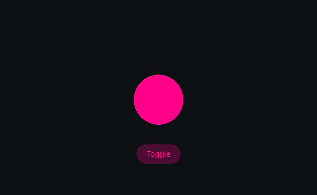 Svelte: Animate on state change
 Svelte: Layout animation
 Svelte: View animation