Page wipe
An example of combining a full page wipe with a shared element transition using Motion's view function. The view function is built on the browser's native View Transition API.
Tutorial
Introduction
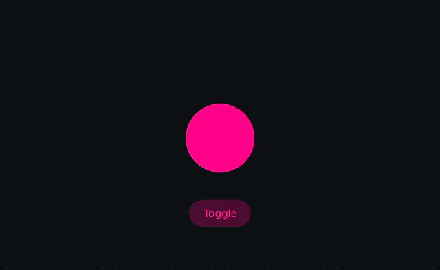
The Page wipe example shows how to create smooth full-page color transitions combined with shared element animations. When clicking a color button, a circular wipe expands from the click position to reveal the new background color, while a white ring seamlessly transitions between buttons.
This effect uses two Motion APIs: animateView, which wraps the browser's native View Transition API to coordinate both animations in a single transition, and press to handle button clicks. The View Transition API is a powerful browser feature that makes it easy to create smooth transitions when the DOM changes.
Motion makes it easy to create these polished interactions with just a few lines of code. The animateView function handles the complex orchestration of updating the DOM and animating the changes, while the browser's native View Transition API ensures the animations are smooth and performant.
Get started
Let's start by creating the HTML structure for our color picker interface. We'll build three circular buttons displayed in the center of the page:
<ul id="color-picker">
<li class="yellow">
<button data-color="#fff312" aria-label="Yellow"></button>
</li>
<li class="blue selected">
<button data-color="#1e75f7" aria-label="Blue"></button>
</li>
<li class="pink">
<button data-color="#ff0088" aria-label="Pink"></button>
</li>
</ul>
<script type="module">
// We'll add our JavaScript here
</script>
<style>
/** Copy styles from example source code */
</style>
Notice the view-transition-name property on the ::after pseudo-element. This tells the browser that this element should be tracked during view transitions, allowing it to smoothly animate between buttons.
The data-color attribute on each button stores the color value we'll use for the background transition. The background uses a dotted pattern created with radial-gradient, where --current-color determines which color is displayed.
Source code
<ul id="color-picker">
<li class="yellow">
<button data-color="var(--hue-0)" aria-label="Yellow"></button>
</li>
<li class="blue selected">
<button data-color="var(--hue-4)" aria-label="Blue"></button>
</li>
<li class="pink">
<button data-color="var(--hue-1)" aria-label="Pink"></button>
</li>
</ul>
<script type="module">
import { press, animateView } from "motion-dom"
import { spring } from "motion"
async function selectColor(element, { currentTarget, pageX, pageY }) {
const update = () => {
const color = currentTarget.getAttribute("data-color")
document
.querySelector("#color-picker")
.style.setProperty("--current-color", color)
const selected = document.querySelector("#color-picker .selected")
selected.classList.remove("selected")
currentTarget.parentElement.classList.add("selected")
}
const animation = await animateView(update, {
duration: 0.4,
ease: [0.28, 0.02, 0.1, 0.99],
}).new(
{
clipPath: [
`circle(0% at ${pageX}px ${pageY}px)`,
`circle(100% at ${pageX}px ${pageY}px)`,
],
},
{ duration: 0.6, ease: "easeIn" },
)
}
press("#color-picker button", (element, event) => {
selectColor(element, event)
})
</script>
<style>
#color-picker {
list-style: none;
padding: 0;
margin: 0;
position: fixed;
--inset: 60px;
top: var(--inset);
left: var(--inset);
right: var(--inset);
bottom: var(--inset);
display: flex;
justify-content: center;
align-items: center;
gap: 20px;
--current-color: var(--hue-4);
background-image: radial-gradient(
circle,
var(--current-color) 10%,
transparent 10%
);
background-size: 20px 20px;
}
#color-picker button {
position: relative;
width: 80px;
height: 80px;
border: none;
border-radius: 50%;
cursor: pointer;
overflow: visible;
outline: 10px solid var(--background);
}
#color-picker .yellow button {
background-color: var(--hue-0);
}
#color-picker .blue button {
background-color: var(--hue-4);
}
#color-picker .pink button {
background-color: var(--hue-1);
}
#color-picker .selected button::after {
content: "";
position: absolute;
top: -8px;
left: -8px;
right: -8px;
bottom: -8px;
border: 4px solid var(--white);
border-radius: 50%;
view-transition-name: color-picker-button;
}
</style>Related examples
Latest in JavaScript
Unlock all 400+ examples
- Source code for every Plus example.
- Provide examples direct to your agent via Motion's MCP.
- Lifetime access to new examples and APIs.