"use client"

import { motion, Transition } from "motion/react"
import { useState } from "react"

/**
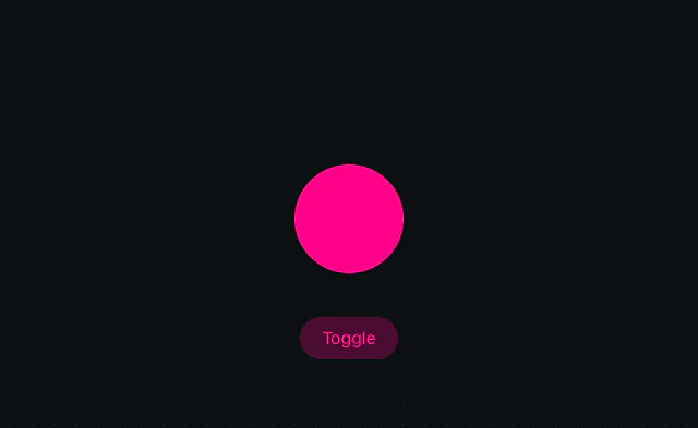
 * A toggle switch that demonstrates custom easing functions with both bounce and spring animations.
 */
function App() {
    const [isOn, setIsOn] = useState(true)

    return (
        <div className="container">
            <div
                className="switch"
                data-is-on={isOn}
                onClick={() => setIsOn(!isOn)}
            >
                <motion.div
                    className="ball"
                    layout
                    transition={isOn ? spring : bounce}
                />
            </div>
        </div>
    )
}

/**
 * ================  Constants  =========================
 */

const bounce: Transition = {
    duration: 1.2,
    ease: bounceEase,
}

const spring: Transition = {
    type: "spring",
    stiffness: 700,
    damping: 30,
}

/**
 * ================  Utils  =========================
 */

// From https://easings.net/#easeOutBounce
function bounceEase(x: number) {
    const n1 = 7.5625
    const d1 = 2.75

    if (x < 1 / d1) {
        return n1 * x * x
    } else if (x < 2 / d1) {
        return n1 * (x -= 1.5 / d1) * x + 0.75
    } else if (x < 2.5 / d1) {
        return n1 * (x -= 2.25 / d1) * x + 0.9375
    } else {
        return n1 * (x -= 2.625 / d1) * x + 0.984375
    }
}

/**
 * ==============   Styles   ================
 */

function Stylesheet() {
    return (
        <style>
            {`
                .container {
                    display: flex;
                    align-items: center;
                    justify-content: center;
                    flex-direction: column;
                    min-height: 100vh;
                }

                .switch {
                    width: 80px;
                    height: 200px;
                    background-color: #fff3;
                    display: flex;
                    align-items: flex-end;
                    border-radius: 50px;
                    padding: 10px;
                    cursor: pointer;
                }

                .switch[data-is-on="true"] {
                    align-items: flex-start;
                }

                .ball {
                    width: 80px;
                    height: 80px;
                    background-color: var(--white);
                    border-radius: 40px;
                    will-change: transform;
                }
            `}
        </style>
    )
}

export default function AppWithStyles() {
    return (
        <>
            <App />
            <Stylesheet />
        </>
    )
}

 Svelte: Animate on state change
 Svelte: Layout animation
 Svelte: View animation