Introduction
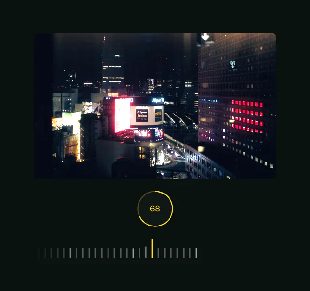
The iOS slider example recreates the playful brightness slider found in the iOS shortcut screen using Motion for React. It features an intuitive drag interaction with a satisfying elastic pull effect, squish and stretch animations, and keyboard accessibility.
In this tutorial, we'll learn to use:
useMotionValueto track the slider's progressuseTransformto map values between different ranges- The
motioncomponent to create interactive animations - Gesture handling with
onTapStart,onPan, andonPanEnd - The
whileFocusprop for animating keyboard accessibility highlighting
Get started
Let's start by setting up the basic structure of our component:
"use client"

import { useRef } from "react"

export default function Slider({
    maxPull = 20,
    maxSquish = 0.92,
    maxStretch = 1.08,
    keyboardStep = 0.05,
    keyboardSpring = { stiffness: 200, damping: 60 },
}) {
    const ref = useRef(null)

    return (
        <div style={container}>
            <div ref={ref} style={slider}>
                <div style={indicator} />
                <div>
                    <SunIcon />
                </div>
            </div>
        </div>
    )
}

/** Copy icons and styles from the example source */
This provides us with a basic slider that looks right, but no interactivity or animations yet.