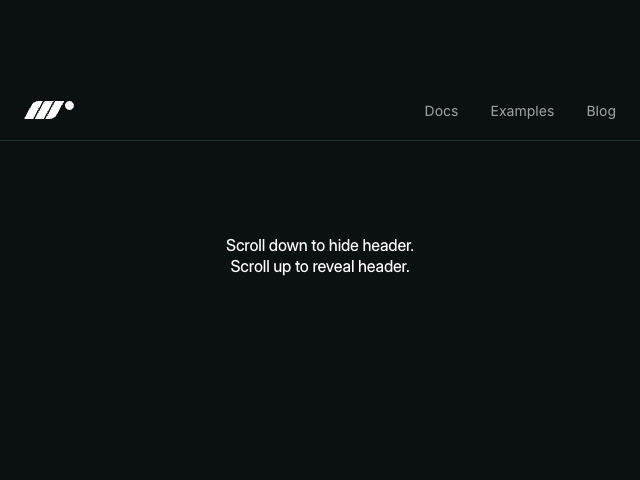
Scroll Horizontal Gallery
A horizontal gallery that scrolls sideways as you scroll down. Uses sticky positioning with scroll-linked x translation.

Source code
"use client"
import { motion, useScroll, useTransform } from "motion/react"
import { useRef } from "react"
export default function ScrollHorizontal() {
const containerRef = useRef(null)
const { scrollYProgress } = useScroll({
target: containerRef,
offset: ["start start", "end end"],
})
// Move from first item centered to last item centered
const totalDistance = (items.length - 1) * (ITEM_WIDTH + GAP)
const x = useTransform(scrollYProgress, [0, 1], [0, -totalDistance])
return (
<div id="example">
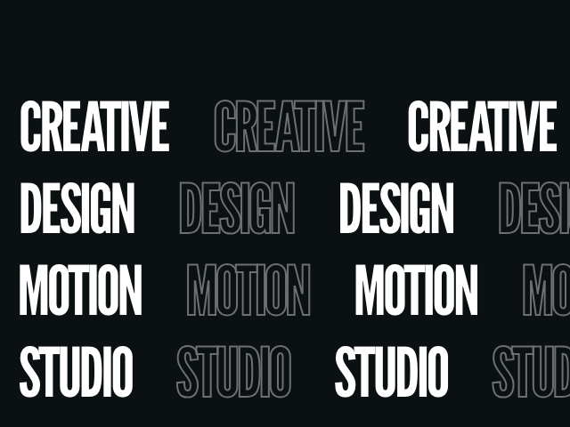
<section className="intro-section">
<h1 className="impact">Tokyo Nights</h1>
</section>
<div ref={containerRef} className="scroll-container">
<div className="sticky-wrapper">
<motion.div className="gallery" style={{ x }}>
{items.map((item) => (
<div
key={item.id}
className="gallery-item"
style={
{
"--item-color": item.color,
"--item-image": `url(${item.image})`,
} as React.CSSProperties
}
>
<div className="item-content">
<span className="item-number">0{item.id}</span>
<h2>{item.label}</h2>
</div>
</div>
))}
</motion.div>
</div>
</div>
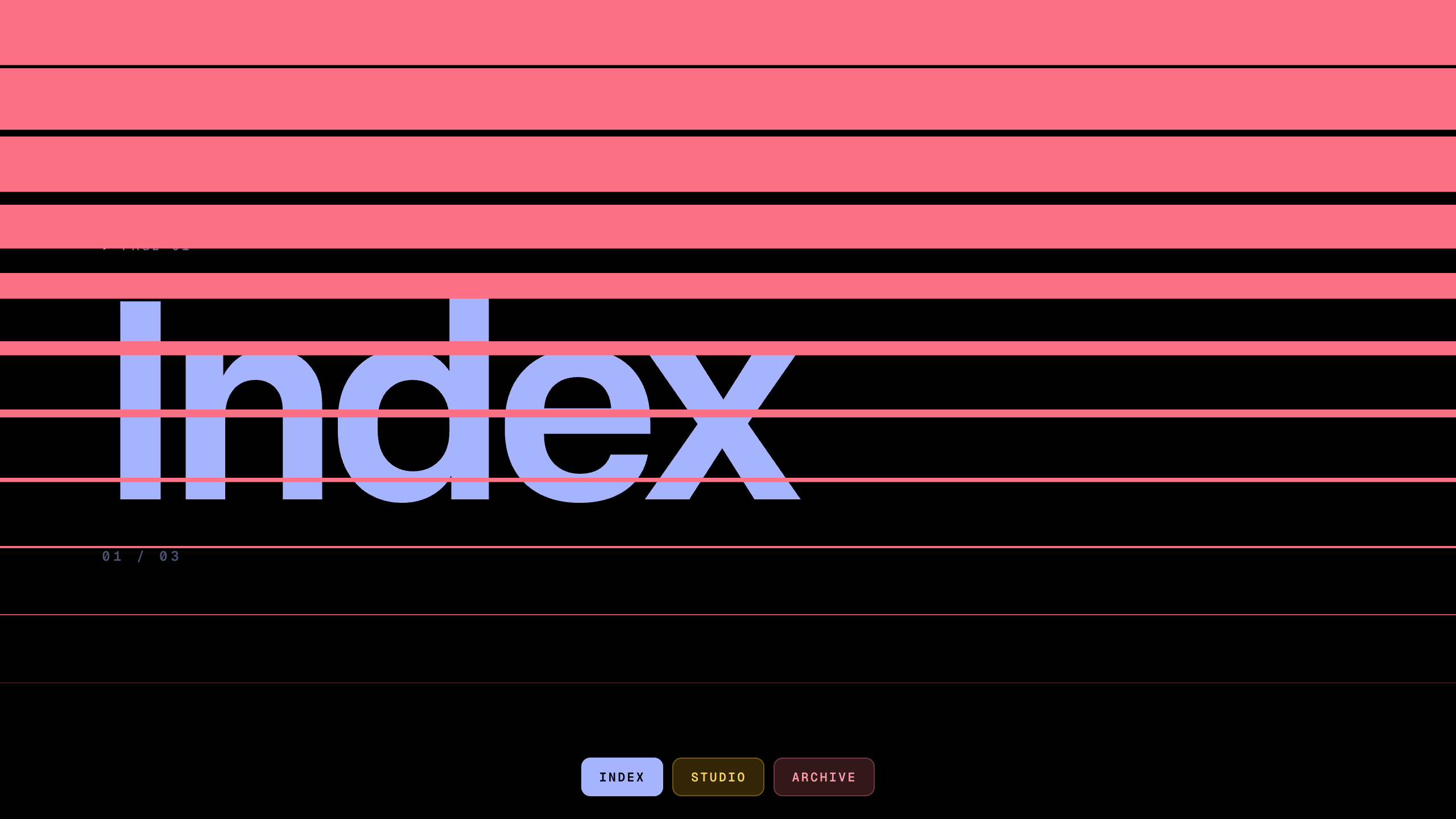
<section className="outro-section">
<p className="big">Fin</p>
</section>
<StyleSheet />
</div>
)
}
/**
* ============== Styles ================
*/
function StyleSheet() {
return (
<style>{`
body {
overflow-x: hidden;
}
#example {
height: auto;
overflow: visible;
}
.intro-section {
height: 50vh;
display: flex;
flex-direction: column;
justify-content: flex-end;
align-items: center;
text-align: center;
padding-bottom: 40px;
}
.intro-section h1 {
font-size: clamp(36px, 8vw, 72px);
color: var(--white);
margin: 0;
text-transform: uppercase;
}
.scroll-container {
height: 300vh;
position: relative;
}
.sticky-wrapper {
position: sticky;
top: 0;
height: 100vh;
width: 400px;
margin: 0 auto;
display: flex;
align-items: center;
justify-content: flex-start;
overflow: visible;
}
.gallery {
display: flex;
gap: 30px;
will-change: transform;
}
.gallery-item {
flex-shrink: 0;
width: 400px;
height: 500px;
border-radius: 12px;
position: relative;
overflow: hidden;
background-image: var(--item-image);
background-size: cover;
background-position: center;
}
.gallery-item::before {
content: "";
position: absolute;
inset: 0;
background: linear-gradient(
to bottom,
transparent 60%,
var(--item-color)
);
mix-blend-mode: multiply;
}
.item-content {
position: absolute;
bottom: 30px;
left: 30px;
z-index: 1;
}
.item-number {
font-size: 14px;
color: var(--item-color);
font-family: "Geist Mono", monospace;
display: block;
margin-bottom: 8px;
}
.gallery-item h2 {
font-size: 28px;
font-weight: 600;
color: var(--white);
margin: 0;
}
.outro-section {
height: 100vh;
display: flex;
justify-content: center;
align-items: center;
}
@media (max-width: 600px) {
.sticky-wrapper {
width: 280px;
}
.gallery {
gap: 15px;
}
.gallery-item {
width: 280px;
height: 350px;
}
}
@media (prefers-reduced-motion: reduce) {
.gallery {
transform: none !important;
}
.scroll-container {
height: auto;
}
.sticky-wrapper {
position: relative;
height: auto;
width: 100%;
overflow-x: auto;
padding: 50px 0;
}
}
`}</style>
)
}
/**
* ============== Data ================
*/
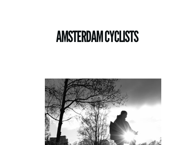
const items = [
{ id: 1, color: "var(--hue-1)", label: "Night One", image: "/photos/tokyo-shinjuku-2/image-1.jpg" },
{ id: 2, color: "var(--hue-2)", label: "Night Two", image: "/photos/tokyo-shinjuku-2/image-2.jpg" },
{ id: 3, color: "var(--hue-3)", label: "Night Three", image: "/photos/tokyo-shinjuku-2/image-3.jpg" },
{ id: 4, color: "var(--hue-4)", label: "Night Four", image: "/photos/tokyo-shinjuku-2/image-4.jpg" },
{ id: 5, color: "var(--hue-5)", label: "Night Five", image: "/photos/tokyo-shinjuku-2/image-8.jpg" },
]
const ITEM_WIDTH = 400
const GAP = 30Related examples

Latest in React

Motion+
Unlock all 400+ examples
- Source code for every Plus example.
- Provide examples direct to your agent via Motion's MCP.
- Lifetime access to new examples and APIs.