AnimateView animates elements between views using the browser's native View Transitions API. It's built on Motion's mini animate() function, so it supports animatable values like clipPath and Motion transitions, including springs.
<AnimateView v-if="isOpen" :transition="{ type: spring }">
  <div class="modal" />
</AnimateView>State updates are wrapped in the startTransition function exported by Motion for Vue:
startTransition(() => {
  isOpen.value = !isOpen.value
})Usage
Import
AnimateView and startTransition are available via motion-v 2.5 and later:
import { AnimateView, startTransition } from "motion-v"startTransition wraps the native document.startViewTransition and awaits Vue's nextTick() internally. Update your refs as normal: the DOM is flushed before the browser captures the new view.
Enter/exit animations
Wrap an element in AnimateView. When it's added or removed from the page inside a startTransition update, it will animate with the browser's default fade in/out.
<script setup>
import { AnimateView, startTransition } from "motion-v"
import { ref } from "vue"

const show = ref(true)

function toggle() {
  startTransition(() => {
    show.value = !show.value
  })
}
</script>

<template>
  <button @click="toggle">Toggle</button>
  <AnimateView v-if="show">
    <div class="box" />
  </AnimateView>
</template>Note: Wrap state changes in startTransition to trigger a view transition. State changes made outside of it update the DOM as normal, without animation.
Configure the transition
The default transition for all animations can be set via the transition prop. It accepts all of Motion's transition options.
<AnimateView :transition="{ duration: 1, ease: 'easeOut' }">
  <div class="box" />
</AnimateView>A specific transition can also be set for enter, exit, share and update animations via each prop:
<AnimateView
  :enter="{ opacity: 1, transition: { duration: 0.6 } }"
  :exit="{ opacity: 0, transition: { duration: 0.3 } }"
>
  <div class="box" />
</AnimateView>To use springs, import spring from motion-v and pass it to the type option:
<script setup>
import { AnimateView, spring } from "motion-v"

const springTransition = {
  type: spring,
  visualDuration: 0.4,
  bounce: 0.3,
}
</script>

<template>
  <AnimateView :transition="springTransition">
    <div class="box" />
  </AnimateView>
</template>transition.layout can be used to set a separate timing for size and position changes:
<AnimateView
  :transition="{
    duration: 0.3,
    layout: { type: spring, visualDuration: 0.6, bounce: 0.2 },
  }"
>
  <div class="box" />
</AnimateView>Setting values
By default, animations use the browser's opacity crossfade. If you set your own values within enter, exit, share or update then this crossfade will be disabled.
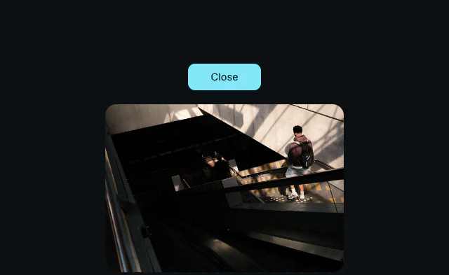
Values can be any animatable value, like clipPath:
<script setup>
import { AnimateView, startTransition } from "motion-v"
import { ref } from "vue"

const isOpen = ref(false)

function toggle() {
  startTransition(() => {
    isOpen.value = !isOpen.value
  })
}
</script>

<template>
  <button @click="toggle">{{ isOpen ? "Close" : "Open" }}</button>
  <AnimateView
    v-if="isOpen"
    :enter="{
      clipPath: [
        'circle(0% at 50% 50%)',
        'circle(75% at 50% 50%)',
      ],
      transition: { duration: 0.6, ease: 'easeOut' },
    }"
    :exit="{
      clipPath: [
        'circle(75% at 50% 50%)',
        'circle(0% at 50% 50%)',
      ],
      transition: { duration: 0.4, ease: 'easeIn' },
    }"
  >
    <img src="/photos/amsterdam-25/image-11.jpg" alt="Amsterdam" />
  </AnimateView>
</template>To restore the fade alongside your custom values, pass opacity too:
:enter="{ opacity: 1, clipPath: [...] }"Animating updates
Wrapped elements will animate when their content or visual styles change, crossfading between the old and new view. This can be customised with the update prop.
In this example, a shimmering skeleton card wipes into the loaded content via an update animation driven by a custom CSS property:
<script setup>
import { AnimateView, startTransition } from "motion-v"
import { onMounted, ref } from "vue"

const wipeTransition = {
  "--wipe": ["100%", "-100%"],
  transition: { duration: 0.6, ease: "easeInOut" },
}

const loaded = ref(false)

onMounted(() => {
  setTimeout(() => {
    startTransition(() => {
      loaded.value = true
    })
  }, 2500)
})
</script>

<template>
  <AnimateView name="skeleton-card" :update="wipeTransition">
    <div v-if="loaded" class="card">
      <!-- Loaded content -->
    </div>
    <div v-else class="card skeleton" />
  </AnimateView>
</template>Size and position changes also animate, which makes reorder-style animations possible. Wrap each item in a keyed AnimateView with a spring transition, then shuffle the list inside startTransition:
<script setup>
import { AnimateView, spring, startTransition } from "motion-v"
import { ref } from "vue"

const items = ref(initialItems)

function shuffle() {
  startTransition(() => {
    items.value = [...items.value].sort(() => Math.random() - 0.5)
  })
}
</script>

<template>
  <button @click="shuffle">Shuffle</button>
  <AnimateView
    v-for="item in items"
    :key="item.id"
    :transition="{
      type: spring,
      visualDuration: 0.3,
      bounce: 0.2,
    }"
  >
    <div class="item">{{ item.label }}</div>
  </AnimateView>
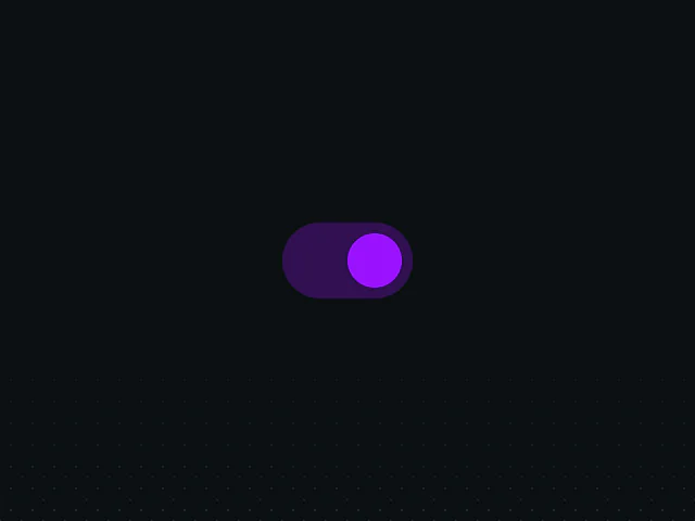
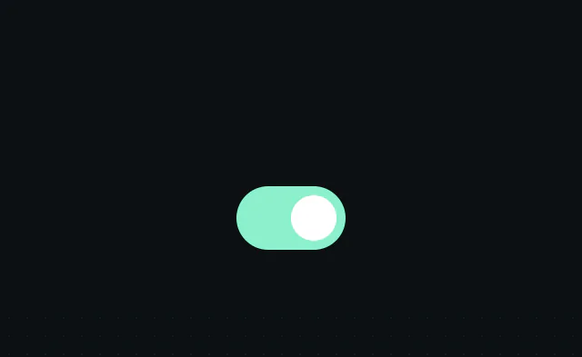
</template>Update animations also power micro state changes like this iOS-style toggle, whose knob glides between states with a spring:
Shared element animations
When an AnimateView with a name exits, and another AnimateView with the same name enters within the same transition, they'll animate as a shared element: the exiting element morphs into the entering one.
This is the same declarative pattern as layoutId in layout animations. You pair two elements with a shared identifier and Motion animates between them. But the underlying mechanism is different: layoutId measures layouts and animates with FLIP, whereas AnimateView morphs browser-rendered snapshots via the View Transitions API. Here, each App Store-style card shares a name with its detail view:
<script setup>
import { AnimateView, spring, startTransition } from "motion-v"
import { computed, ref } from "vue"

const openId = ref(null)

function open(id) {
  startTransition(() => {
    openId.value = id
  })
}

function close() {
  startTransition(() => {
    openId.value = null
  })
}

const openItem = computed(() => items.find((item) => item.id === openId.value))
</script>

<template>
  <!-- Card list -->
  <template v-if="!openItem">
    <li v-for="item in items" :key="item.id" class="card">
      <AnimateView :name="`card-${item.id}`" :transition="cardTransition">
        <div class="card-content" @click="open(item.id)">
          <img :src="item.image" alt="" />
        </div>
      </AnimateView>
    </li>
  </template>

  <!-- Detail view -->
  <template v-else>
    <div class="overlay" @click="close" />
    <AnimateView :name="`card-${openItem.id}`" :transition="openCardTransition">
      <div class="card-content">
        <img :src="openItem.image" alt="" />
        <h2>{{ openItem.title }}</h2>
      </div>
    </AnimateView>
  </template>
</template>The animation is configured via the transition or share props on the entering component.
Note: If there is more than one element with a specific name either before, or after the transition, the animation will fail. name must be unique per view, so omit it when you're not matching elements.
Transition types
startTransition accepts a types option, an array of strings that provide contextual information about the transition, like navigation direction:
function navigate(direction) {
  startTransition(
    () => {
      index.value = wrap(
        0,
        images.length,
        index.value + (direction === "next" ? 1 : -1)
      )
    },
    { types: [direction] }
  )
}enter, exit, share and update can each be defined as a function that receives these types and returns the animation to perform. In this direction-aware carousel, slides enter and exit from the correct side depending on whether the transition was tagged "next" or "prev":
<script setup>
import { AnimateView, spring, startTransition, wrap } from "motion-v"
import { ref } from "vue"

const index = ref(0)

const slideTransition = {
  type: spring,
  visualDuration: 0.3,
  bounce: 0.2,
}

function enterSlide(types) {
  return {
    opacity: 1,
    transform: [
      `translateX(${types.includes("next") ? 100 : -100}%)`,
      "translateX(0%)",
    ],
  }
}

function exitSlide(types) {
  return {
    opacity: 0,
    transform: `translateX(${types.includes("prev") ? 100 : -100}%)`,
  }
}
</script>

<template>
  <button aria-label="Previous" @click="navigate('prev')" />
  <AnimateView
    :key="index"
    :name="`slide-${index}`"
    :transition="slideTransition"
    :enter="enterSlide"
    :exit="exitSlide"
  >
    <img :src="images[index]" :alt="`Prague ${index + 1}`" />
  </AnimateView>
  <button aria-label="Next" @click="navigate('next')" />
</template>startTransition
startTransition(update, options?) runs a state update inside a native view transition. Any AnimateView that enters, exits, updates or shares an element during the update will animate with its configured animations.
It returns the native ViewTransition object, which you can use to hook into the transition lifecycle:
const transition = startTransition(() => {
  show.value = !show.value
})

transition?.finished.then(() => {
  console.log("Transition finished")
})It returns undefined when the update is queued behind a transition that is still playing. Queued updates run together when that transition finishes. It also returns undefined when the browser doesn't support the View Transitions API, or during SSR. In that case the update still runs, without animation.
Options
types
Contextual labels forwarded to functional enter/exit/share/update props. See Transition types.
root
By default, the document root is excluded from the transition, so unnamed content changes (like a button's text) hard-cut instead of riding a full-page crossfade. Pass { root: true } to keep the browser's default full-page crossfade:
startTransition(update, { root: true })Performance
View transitions work by snapshotting the old and new views as images, then moving, scaling and cross-fading those snapshots.
This makes them a great choice for page-level transitions, like route changes or swapping large views, where coordinating individual element animations would be complex.
However, view transitions are not interruptible: once started, a transition must finish (or be skipped) before the next can begin. Motion's layout animations, by comparison, are fully interruptible and respond to new input mid-animation. For micro-interactions and gesture-driven UI, layout animations remain the better choice.
Props
Default slot
The content to animate. AnimateView adds no wrapper element to the DOM, and supports multiple root nodes.
name
An identifier for matching elements in shared element animations. Must be unique per view, so omit it when not matching elements.
<AnimateView :name="`card-${item.id}`">
  <div class="card-content">
    <img :src="item.image" alt="" />
  </div>
</AnimateView>transition
The default transition to use for all animation types. Accepts all Motion transition options, including springs via the spring function imported from motion-v. Can be overridden per animation type via each prop's own transition, and supports per-value options and a layout timing for size/position changes.
<AnimateView :transition="{ type: spring, visualDuration: 0.4, bounce: 0.3 }">
  <div class="box" />
</AnimateView>enter
The animation to perform when the element enters the DOM. Defaults to the browser fade-in.
Accepts an object of values (with an optional transition), or a function that receives the current transition types and returns an object of values.
<AnimateView :enter="{ opacity: 1, transform: ['translateX(100%)', 'translateX(0%)'] }">
  <div class="box" />
</AnimateView>exit
The animation to perform when the element leaves the DOM. Defaults to the browser fade-out.
Accepts an object of values (with an optional transition), or a function that receives the current transition types.
<AnimateView :exit="{ opacity: 0, transform: 'translateY(20px)' }">
  <div class="box" />
</AnimateView>update
The animation to perform when the element's content, style, size or position changes. Defaults to the browser crossfade, plus a size/position animation.
Accepts an object of values (with an optional transition), or a function that receives the current transition types. Setting custom values replaces the crossfade, but the size/position animation is kept.
<AnimateView :update="{ '--wipe': ['100%', '-100%'] }">
  <Card :content="content" />
</AnimateView>share
The animation to perform when this element enters as another AnimateView with the same name exits. Set on the entering component. Defaults to the browser's shared element morph.
Accepts an object of values (with an optional transition), or a function that receives the current transition types. Setting custom values replaces the crossfade.
onAnimationStart
A callback that fires when an animation starts, receiving the animation controls and the type of animation ("enter", "exit", "update" or "share").
<script setup>
function handleStart(animation, type) {
  animation.speed = 0.5
}
</script>

<template>
  <AnimateView @animation-start="handleStart">
    <div class="box" />
  </AnimateView>
</template>onAnimationComplete
A callback that fires when an animation finishes, receiving the type of animation ("enter", "exit", "update" or "share"). Not called for animations cancelled when the component unmounts mid-playback.
<AnimateView @animation-complete="(type) => console.log(type, 'done')">
  <div class="box" />
</AnimateView>