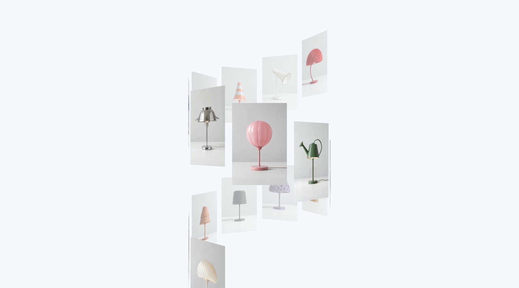
Introducing Motion UI Gallery
Meet the Motion UI Gallery for React. Eight 2D and 3D arrangements, detail views and gestures that all transition smoothly into each other.

When I was but a lad, "lightbox" plugins were the impressive new thing to slap on your fansite. These days, the best ones are all bespoke Awwwards fodder. Hand-tuned to do one thing beautifully, then thrown away for the next site.
Today, we're launching Gallery, a new Motion UI component for React (with Vue on the way!)
It's a new component for building award-winning image and video galleries that work in both 2D and 3D, where every arrangement, gesture and detail view transitions smoothly into the next.
The trouble with galleries
There are plenty of gallery libraries out there. Most do one thing well: a lightbox, or a masonry grid, or a slider. The problem comes when you try to mix functionality.
For instance, how do you take an image rotated in 3D, and open it into a flat, full-screen detail view, with a shared element transition that doesn't jump?
How do you smoothly swap the low-res thumbnail asset for a hi-res detail image?
How would you make an infinite, pannable grid with only 12 images?
Often, the answer to these more ambitious questions is WebGL. A canvas can draw anything, anywhere, at any angle. But you lose a lot, too: real img and video elements, text selection, accessibility, CSS styling, and the additional filesize overhead.
Enter Motion UI Gallery
This is why we built Motion UI Gallery. You give it your images and videos, pick an arrangement, and it handles the rest.
<Gallery arrange={barrel()} aria-label="Collection">
  <Gallery.Image src="/a.jpg" alt="Runner" width={1200} height={1600} />
  <Gallery.Video src="/b.mp4" poster="/b.jpg" alt="Shoe rotating" />
</Gallery>
Every item is a real img, video or li. Everything you see, every 3D rotation and every transition, is rendered completely in the DOM with CSS transforms. No canvas, no WebGL.
Arrangements
Gallery ships with eight built-in arrangements: list, grid, barrel, coverflow, helix, ring, sphere and stack.
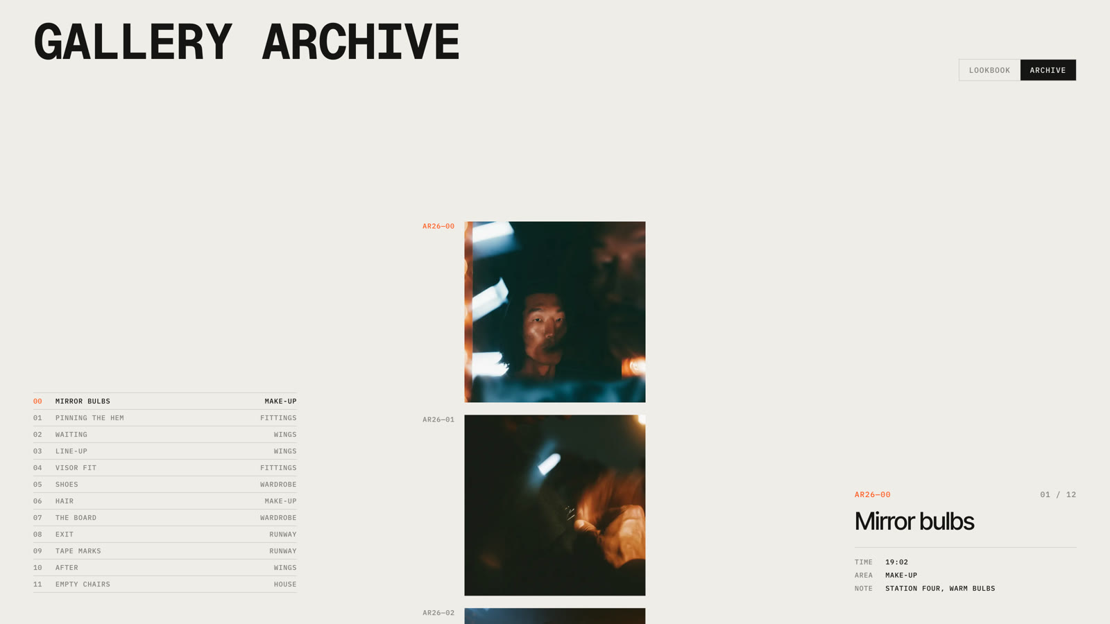
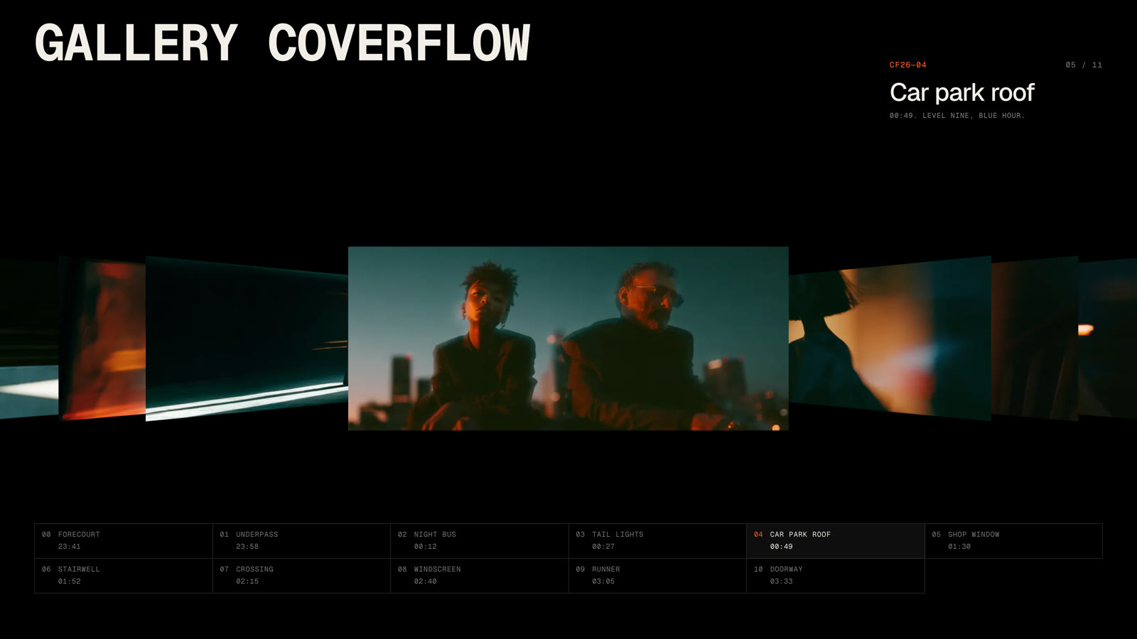
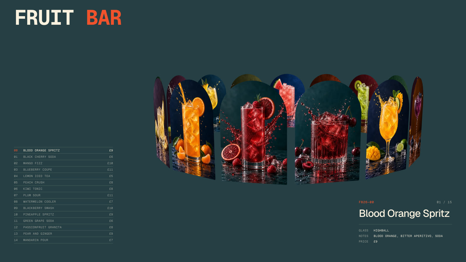
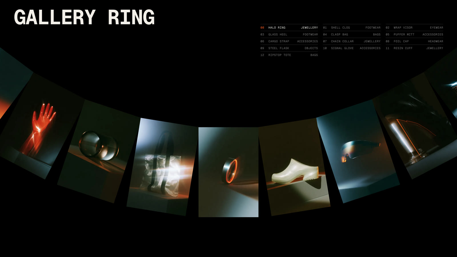
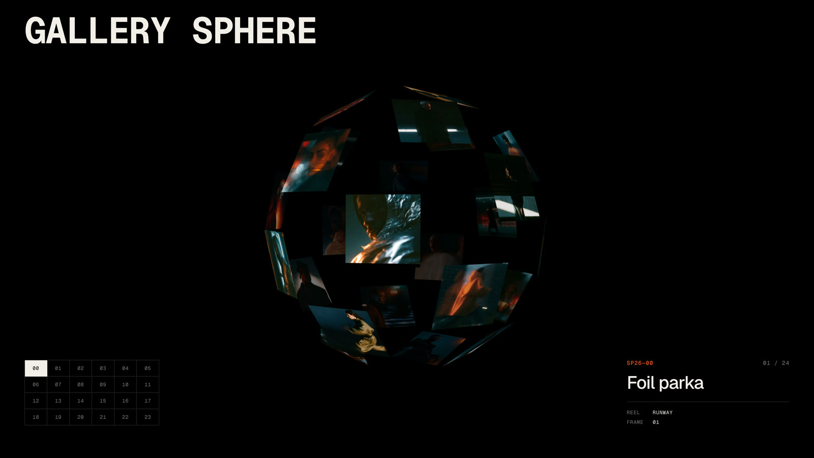

Each one is configurable well beyond its default shape. A list can rise on a diagonal, curl away from focus or, with upcoming shader support, ripple in a wave. A grid can lean back in 3D and bulge towards the viewer. A ring with an arc under 360 becomes a fan.
<Gallery arrange={list({ angle: -30, curl: 20, depth: 40, wave: 30 })} />And every numeric option also accepts a motion value. So you can animate a barrel's camera tilt, or link a helix's radius to scroll, without a single re-render.
If none of the eight fit your design, defineGalleryArrangement lets you write your own. An arrangement is just a function that writes the pose of one item from its position relative to focus.
const wave = defineGalleryArrangement(({ amplitude = 80 }) => ({
  item(t, index, { along }, out) {
    out.x = along(index)
    out.y = Math.sin(t * 0.6) * amplitude
  },
}))
Transitions
This is the part we obsessed over. Change arrange, and the gallery animates into its new shape. Not from where the last shape was, but from wherever every item is right now: mid-drag, mid-spring, or mid-way through another transition.
To make this work, Gallery never blends between transform matrices. Each item's pose is stored as separate values: position, three rotations, scale and opacity. Poses blend each value separately, so an item turning off the side of a barrel and onto a flat list takes a natural path, whereas matrices can be unpredictable.
Additionally, animations where items fly in opposing directions or across the screen are actively harmful to understanding state transitions. We actively reduce motion so that collections of items can animate together: left, right, up, down, inwards, outwards. But never chaotically, against each other.
The same goes for adding and removing items. enter and exit take a presence preset like fade, contract, scatter or slideAlong, and each arrangement picks a sensible default.
Detail views
Click an item, or press Enter when it's selected, and it opens. By default it opens inline: it grows in its own slot and its neighbours move smoothly out of the way.
Set selection to galleryDetail and the open item instead moves into a Gallery.Detail box, while the others line up as thumbnails in a Gallery.Strip. Both are placeholders. You position them with CSS, so full-screen or inline is a style decision, not an API one.
<Gallery arrange={grid()} selection={galleryDetail}>
  {items}
  <Gallery.Detail className="detail" />
  <Gallery.Strip className="strip" />
</Gallery>
This is a 3D shared element transition. The item leaves its place on the curve of a sphere or a helix, untwists, and lands flat in the detail box, all in the DOM. Close it, and it flies back to where it came from.
The detail view also loads high-res assets automatically. Give an item a detailSrc and Gallery loads it when the item opens, waits until it's decoded, then fades it in over the thumbnail. No flash, no layout shift. It even starts loading on pointer down, before the click completes.
<Gallery.Image
  src="/runner-640.jpg"
  detailSrc="/runner-2400.jpg"
  alt="Runner"
/>
For something more editorial, galleryReveal grows a panel out of the open item's box, so captions, specs and buttons arrive with it.
Gestures and modifiers
Galleries can be dragged, scrolled with a wheel or touchpad, and navigated with the keyboard out of the box. A drag throws with momentum, then snaps to the nearest item. Open shapes can loop forever, and fade items and the edges of the wrap so nothing pops into place.
Because the engine knows the gallery's velocity every frame, it can feed it back into the items. The tilt and ripple modifiers link each item to the speed of the gallery, and you can write your own.
<Gallery modify={tilt({ amount: 14, max: 40 })} />Or hand control to something else entirely. offset and progress accept a motion value, so a gallery can be driven by page scroll, like the helix of looks in the Runway example.
Accessible and performant
Gallery uses the correct ARIA roles and respects reduced motion by default. Arrow keys move through items, Home and End jump to either end, and Escape closes an open item.
Every item is animated with transform and opacity. Only visible media loads, only visible videos play, and by default no more than three play at once.
Arrangements, modifiers and presence presets are separate imports, so you only bundle what you use. The base Gallery starts at 19.6kb, or 25.8kb with the detail view.
How do I get Motion UI Gallery?
This was a whirlwind tour of the new Motion UI Gallery, but not an exhaustive one. We didn't cover the useGallery and useGalleryItem hooks for building your own controls and per-item effects. Or the vars option, which optionally writes each item's depth and open progress to CSS variables every frame. But I've given you an idea of the kind of details that we obsessed over.
Gallery is a premium component available today for React. It's included in Motion+, and Motion UI provides over 20 pre-built examples to start from, from a scroll-linked runway to a turning barrel of fittings. Ready to drop into your project via copy/paste, AI or shadcn install.
Motion+ is a one-time fee, lifetime membership to:
-
Premium APIs like
Gallery,Carousel,Ticker,AnimateNumberandsplitText -
Motion UI, a growing library of production-ready animated sections
-
Unlock a vault of 490+ examples and 110+ tutorials
-
Early access to new content and APIs
-
A private Discord with over 600 Motion superusers
-
Visual and AI editing tools for your code editor
I hope to see you in the Discord! I can't wait to see what you build with Gallery.